21 Best animated Logo Video Examples you shouldn’t miss
Table of contents
Did you know the first animated logo was created for NBC in 1956? Since then, the popularity of animated logos has only continued to grow, and for a good reason.
With social media and video marketing on the rise, an eye-catching animated logo can make all the difference in capturing your audience’s attention and leaving a lasting impression.
The versatility of animated logos is unmatched. They can be used in various settings, from your website’s header to the beginning and end of one of your explainer video examples. They can also be customized to fit your brand’s unique style and personality, making them a perfect fit for businesses of all sizes and industries.
In this blog post, we’ve compiled a list of 21 of the best-animated logo video examples you shouldn’t miss. From well-known brands like Google and Netflix to up-and-coming startups, we’ve got a range of logos that will inspire and excite you.
So sit back, relax, and get ready to be blown away by the creativity and innovation of these animated logos!
Watch the appealing 21 animated Logo Video Examples now!
1. Google
Google’s animated logo isn’t only a visual treat. It’s about scalability and engagement and highlights the importance of branding in a digitally advanced world.
Google uses animation to transform the word “Google” into a microphone, a pulsating wavelength, bouncing dots, and a “G” with four colours.
- The animation uses primary colours to reflect the smooth movement from the letter G to the balls to the brand’s name to the voice typing feature.
- The animated Google logo is designed to instantly capture the viewer’s attention. The bright colours, fluid movements, and fun animations draw people in, making them more likely to remember the Google brand.
- Animated logos tend to be more memorable than static logos. The dynamic and playful nature of the Google logo ensures that it sticks in the viewer’s mind, making it easier for them to recall the brand when needed.
- Innovation and fun create a brand personality that reinforces Google’s commitment to delivering fresh, exciting, and relevant content to users.
- The animated Google logo can be used in various contexts and across multiple platforms, including TV ads, social media, websites, and apps. This versatility makes integrating into various marketing campaigns easy and maintains consistency across channels.
What sets this video apart
Its style and use of basic colours make it appropriate for every citizen, irrespective of any selective choice.
2. LUX
As an investment company, Lux Capital has the major goal of making large profits. The Lux Capital logo animation is memorable and distinctive, making it easier for viewers to recall the brand. The animation is simple yet visually striking, creating an impression that lingers in the viewer’s mind.

- Changing the angle of the “X” in Lux entailed taking advantage of addition, multiplication, and profit. When the “X” rotates, it marks a nod to profit, as is seen in how it rises upwards and to the right.
- The Lux Capital logo is one of the video logo examples that uses visual storytelling to convey the company’s message concisely and engagingly.
- The Lux Capital logo animation is innovative and reflects the company’s commitment to investing in innovative technologies. This helps Lux Capital to position itself as a forward-thinking company, attracting potential investors and partners who share their vision.
What sets this video apart
Bringing ‘X’ under the spotlight, the brand’s name moves diagonally upwards, suggesting taking the company to greater heights.
3. Netflix
The Netflix brand has become synonymous with streaming entertainment, and its animated logo plays an important role in communicating its brand identity.
The Netflix animated logo begins with the iconic red N appearing on screen, followed by the rest of the letters spelling out the brand name. This is reinforced by the sound design of the logo, which features a distinctive “ta-dum” sound that has become synonymous with the brand.
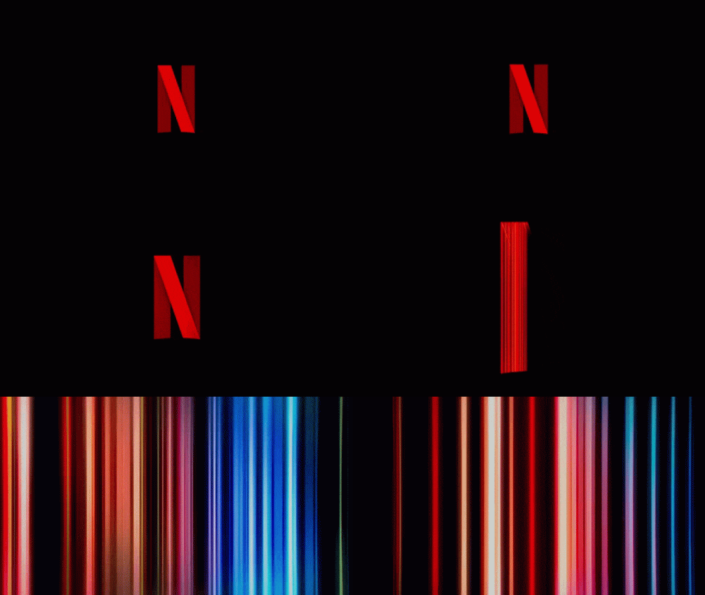
- The Netflix brand logo is a prime example of a well-designed animated logo that effectively captures the essence of the brand and its mission.
- One unique aspect of the Netflix logo is its simplicity. The animation consists of just a few quick, fluid movements yet conveys a powerful message. This simplicity allows the logo to be easily recognizable and memorable.
- Another unique aspect of the Netflix logo is its versatility. It can be easily adapted to suit different contexts, such as adding different colours or styles for special events or promotions. This flexibility ensures that the logo remains fresh and engaging to viewers over time.
- From a marketing perspective, the Netflix logo effectively conveys the brand’s core values and benefits. The bright red colour and bold font communicate a sense of excitement and energy, while the smooth animation conveys a sense of sophistication and quality.
- It helps create a positive and memorable impression on viewers, increasing brand awareness and customer loyalty. Overall, the Netflix logo is a standout example of how an animated logo can be visually appealing and effectively convey a brand’s message.
What sets this video apart
This short animation lasts only a few seconds but effectively conveys the brand’s message of simplicity and accessibility. The Netflix logo employs a simple design featuring the brand’s iconic red lettering. The logo’s short duration and sound use also help create a memorable and emotionally resonant experience for viewers.
4. Captain Paris
Introducing Captain Paris, the premium brand for the modern adventurer. Its logo captures the essence of adventure and exploration with a sophisticated design embodying the high seas’ spirit.

- An animated logo for this French high-end cruise company brings a captain’s portrait and an Eiffeltower-inspired anchor.
- By merely looking at the logo, anyone can easily understand and know about the brand and its services.
- The brand’s use of golden-brown and black hues creates a connection to the iconic Eiffel Tower in Paris, the city from where the brand originates.
- From a marketing perspective, the modernistic approach to promoting the services through logo animation is designed to captivate potential customers and encourage them to take advantage of what we offer.
What sets this video apart
Expressing the name through visuals gives a direct idea of what Captain Paris is about. It shows the necessity of aligning everything on the website with the brand’s objective.
5. Fiverr
While maintaining its familiarity with consumers, the animated Fiverr logo incorporates an exciting entrance animation that features the wordmark in “Fiverr green” and white. This dynamic animation showcases the platform’s ability to rapidly complete projects through the use of freelancers, adding a sense of energy and vibrancy to the brand.

- The Fiverr brand logo is one of the best examples of logos and marketing due to its simple yet clever design incorporating spelling wordmarks.
- The quick movement of the logo leads represents the platform’s commitment to connecting freelancers with clients.
- Furthermore, the Fiverr logo’s dynamic and versatile animation allows it to be used in various contexts and formats. Whether a short intro for a promotional video or a subtle animation on the website’s homepage, the Fiverr logo’s animation is adaptable to different needs and platforms.
- It is distinctive, memorable, and adaptable, making it a powerful tool for promoting the Fiverr platform and its values.
What sets this video apart
Its simplicity and quick movement are the two main features that make this logo animation stand out.
6. Bullhide Belts
The animated logo for Bullhide Belts, created using a brush stroke style, shows a belt twisting into a bull’s head and snorting smoke as the animal grows.

- The Bullhide Belts logo animation is consistent with the brand’s overall aesthetic and messaging, which is essential for establishing a strong brand identity.
- Using a belt to create the structure of the bull in the beginning, along with the breathing movement, represents the whole concept of the brand name.
- The Bullhide Belts logo animation uses storytelling to create a connection with viewers.
- The animation showcases the brand’s commitment to innovation, creativity, and originality, which can attract customers who appreciate these values.
- The animation’s simplicity and striking visuals make it easy to remember, increasing the chances that viewers will remember the brand when they need a new leather belt or wallet.
What sets this video apart
The brand’s name and tagline are conveyed through a brief animation that tells a captivating story, making it an exceptional logo animation that stands out.
7. Echo
The logo, designed by Truf Creative for Echo Capital Group, moves from left to right, creating a visual sense of motion that leaves us believing that we are moving or traveling across each letter.

- From an animation point of view, the logo employed attention-grabbing motion graphics to perfectly capture the essence of the brand’s innovative and forward-thinking approach.
- The horizontal and vertical lines moving through the solid letters make the Echo Capital Group logo stand out.
- Using two pastel colours brings modernity and consistency throughout, making it more memorable and engaging.
What sets this video apart
What sets the Echo logo apart from others is its versatility. Due to its dynamic and eye-catching design, the logo can be used in various contexts, from promotional videos to social media content. It is also easily recognizable, making it an effective tool for brand recognition.
8. Kwickr
Kwickr’s logo by designer Milos Zdrale uses quickly appearing letters and a minimalist and modern style to reflect the fast-paced identity of the brand perfectly

- The Kwickr logo animation immediately catches the viewer’s attention with its bold, vibrant colours and energetic movement.
- The Kwickr logo animation visually represents the brand’s secure, fast, and easy communication messaging.
- The animation’s speedy typing of the letters of the brand name symbolizes quick messaging, while the shield represents security. Combining these elements creates a visual representation of the brand’s core values, making it easier for customers to understand and connect with the brand.
- The Kwickr logo animation uses modern techniques such as flat design and bold typography, which can appeal to a contemporary audience. The animation’s sleek and modern design can help make the brand more relevant and up-to-date.
What sets this video apart
The simple yet powerful brand message of great messaging services that the logo animation displays quickly and simply.
9. Boro
Animating a logotype in this manner can enhance its character, whether it has rigid geometry, sharp angles, or rounded curves. Boro, a UI design agency, developed for itself this animated logo.

- The type is shown rolling out of the letters, enhancing the rounded shapes of each letter. After a slight hesitation, the full stop at the end pops up from the curve of the ‘r,’ making this a nice finishing touch. The agency is made to seem fun, hip, and approachable.
- The Boro logo animation uses yellow, white, and black that can evoke feelings of comfort, reliability, and trust. These associations can help potential customers feel more positively towards the brand and perceive it as a dependable and trustworthy option.
- The Boro logo animation’s simple and minimalist design can help the brand stand out in a cluttered digital landscape. The animation’s straightforward approach can make it easier for potential customers to understand and connect with the brand quickly.
What sets this video apart
The Boro brand logo stands out from other animated logos due to its unique design, captivating animations, and how it effectively communicates its message. Overall, the Boro brand logo stands out in the world of animated logos thanks to its distinctive design and powerful messaging.
10. Frameline
Take a look at the animated logo of Frameline. In this animated logo, which is meant to be reminiscent of the framing mechanism of a film camera, the frame is evoked. Initially, there is only a camera focus, and then the brand name is shown artistically in a straight line.

- The Frameline, as a media arts nonprofit, tries to show the power of queer cinema, and its logo starts with the angle of a frame transforming into the name of the brand.
- The way the frame line separates the photos in the reel, the brand tries to show the different identities considered nonexistent.
- The brand chose blue and white colours for the logo to represent inspiration, purity, simplicity, and wisdom, to show how the LGBTQ+ family consists of all of these.
- The Frameline logo animation helps establish the brand’s recognition and credibility, making it easier for potential customers to connect with and remember the brand.
What sets this video apart
The logo animation depicts the story of the queer cinema production brand in just 2-3 seconds with no complexity.
11. Allvit
Logos with animations can also draw attention to something that may have been overlooked in the original. Some logos convey meaning through the use of symbols that are hidden within the negative space of their designs.
Those who have seen the famous FedEx logo will attest to how persistent this can be. A moving version can capitalize on and make these features more evident. With this animated logo, Nikita Melnikov highlights the site’s searchability by emphasizing the magnifying glass in the negative space of the ‘a’.

- The Allvit logo animation is unique in its conceptualization. It uses a minimalistic design approach to showcase the brand’s values and purpose effectively.
- The Allvit logo animation uses innovative techniques to create a sense of excitement and curiosity in the viewer.
- The Allvit logo animation is consistent with the brand‘s overall visual identity, including its logo, typography, and colour palette. This consistency can help establish the brand’s recognition and credibility, making it easier for potential customers to connect with and remember the brand.
- In terms of how the Allvit logo animation differs from others, its minimalistic design, innovative animation techniques, and storytelling set it apart from other logo animations. Its unique approach can help it connect with a specific audience and stand out in a competitive marketplace.
What sets this video apart
Allvit’s use of a magnifying glass as a search icon in its animated logo effectively conveys the brand’s mission as a solution provider in the field of medicine. This creative choice sets Allvit apart from competitors, as the animated logo serves as a detailed and powerful marketing tool that effectively communicates the brand’s message.
12. Disney
The Disney logo is a universally recognized symbol of magic and imagination, with its iconic wordmark set against the backdrop of the Disneyland castle. This logo evokes a sense of childhood nostalgia and wonders, perfectly capturing the essence of the Disney brand.
The animated logo takes this magic one step further with a shooting star that gracefully arcs above the castle, creating a truly enchanting effect. The Walt Disney Pictures production studio uses this logo animation to introduce every Disney movie, setting the stage for a world of fantasy and dreams come true.
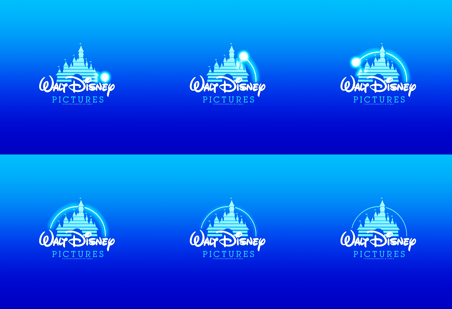
- One unique aspect of the Disney brand logo is its ability to transport viewers to a magical and imaginative world through animation. Animation also allows for a sense of nostalgia, which is important for a brand that has been around for almost a century.
- The logo has a strong brand identity that is instantly recognizable, and the animation helps to reinforce this brand recognition.
- Animation has evolved to keep up with the changing trends in animation and technology, which helps keep the brand fresh and relevant.
- Overall, the animated Disney brand logo is visually appealing and has a strong emotional connection with its audience, making it an effective tool for marketing and brand recognition.
What sets this video apart
The use of bright colour shades with shining white colour branding creates the perfect blend of magical logo animation that has attracted people for almost a century.
13. McDonald’s
The golden arches of the McDonald’s logo are instantly recognizable worldwide, making it one of the most iconic logos in history. This logo has become synonymous with fast food and ingrained in popular culture as a symbol of American cuisine.
The McDonald’s logo has undergone several changes over the years, but the golden arches have remained a constant, a testament to the brand’s enduring popularity and success.
- It is a globally recognized logo synonymous with the brand and its values. The use of animation adds an element of playfulness and fun that appeals to both children and adults, making it an effective marketing tool.
- The design of the animated logo is simple yet striking, featuring iconic golden arches that are instantly recognizable. The logo has evolved, with the latest animated version featuring a simplified and modernized version of the golden arches.
- The animated logo has been used in several successful advertising campaigns, such as the “I’m Lovin’ It” campaign.
What sets this video apart
The use of vibrant colours in crafting the iconic logo for the renowned fast food chain has established a strong association with happiness in customers’ minds. As a result, the logo’s design has become a prominent example of creativity and will continue to dominate in this regard.
14. Fujio Studio
Animating the logo enabled Adam Muflihun to explain what Fujio Studio does while creating and drawing the logo.
- From an animation perspective, the logo employs traditional and modern animation techniques, starting from the graph-like drawing and converting into the striking blue design with the brand name.
- The logo’s animation is carefully crafted to convey the brand’s creative vision and expertise in animation, providing potential clients with a glimpse into the world of Fujio Studio.
- One key factor that sets the Fujio Studio logo apart from others is its simplicity. Despite traditional animation techniques, the logo’s design is clean, modern, and easily recognizable. This makes it an effective tool for brand recognition and recall.
- It demonstrates the importance of attention to detail and brand storytelling design in creating a brand that stands out in a crowded marketplace.
What sets this video apart
The logo’s animation is seamlessly integrated with the studio’s name and tagline, creating a cohesive and unified visual representation of the brand.
15. Eat
Animation is useful for other concepts, too. Fable made this logo that literally grows with every “bite” as the typographic characters grow thicker.
- The logo features “Eat” in bold, stylized letters. It incorporates the entry of food in a horizontal line, making the word ‘EAT’ fuller and thicker as if a human is eating and gaining fat by showing the word ‘FAT.’
- In the end, the structured lines portray a modern addition to the logo.
What sets this video apart
The logo animation’s ability to effectively convey the brand’s storyline within a short duration while maintaining a distinctive logo style is precisely what sets it apart from other logo animations.
16. Snapchat
The logo features a simple and recognizable ghost icon brought to life through animation. The ghost character moves and changes expressions, conveying a playful, lighthearted personality that aligns with Snapchat’s brand identity.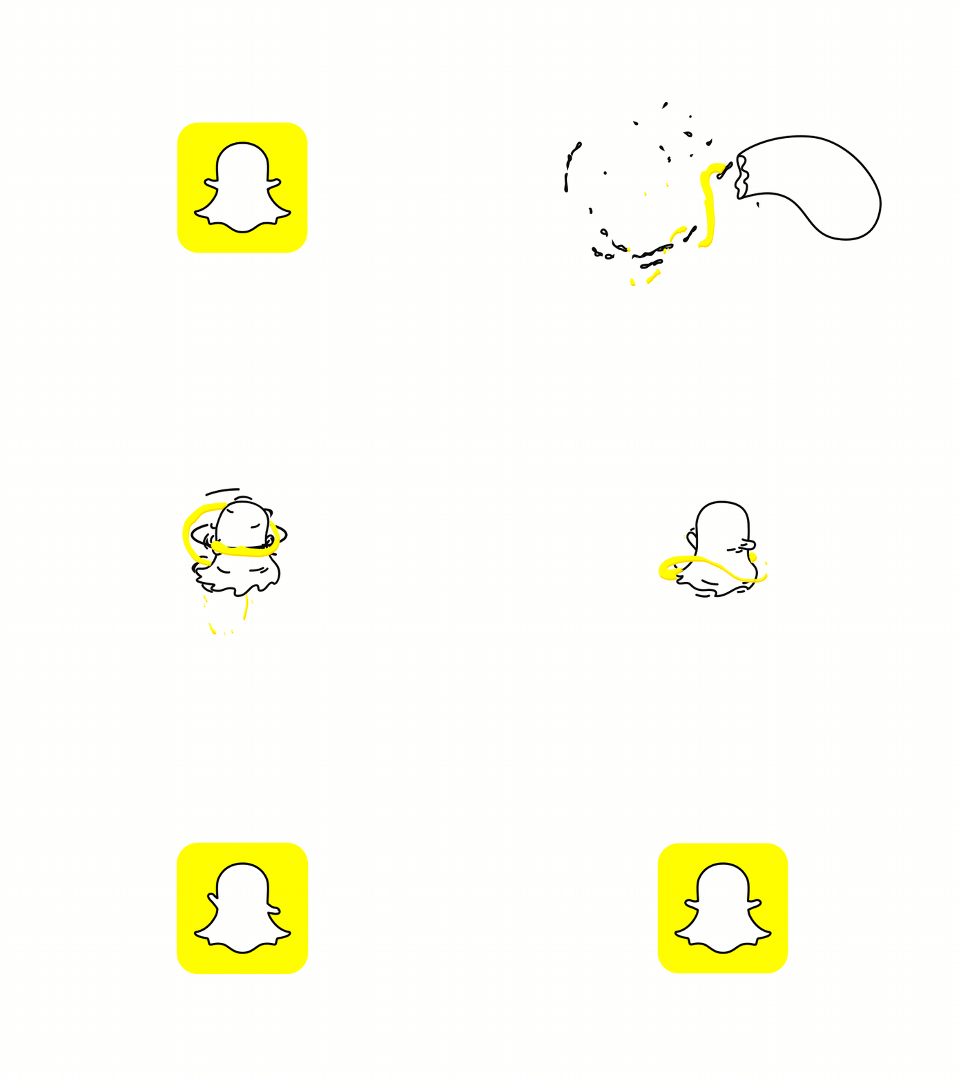
- The animated Snapchat brand logo is one of the best from animation and marketing perspectives due to its unique and playful design.
- The logo highlights a white ghost with a mischievous smile, representing the brand’s focus on fun and spontaneity, adding an element of humour and charm to the brand.
- The logo’s animation creates a sense of engagement and interactivity with the audience, making it more memorable and recognizable.
- The logo’s simplicity and ability to work well on various platforms, from mobile devices to billboards, make it versatile and easy to incorporate into different marketing campaigns.
- The logo’s design reflects the brand’s focus on real-time sharing moments and the idea of disappearing content, which aligns with Snapchat’s core features.
What sets this video apart
The Snapchat animated logo effectively captures the essence of the app’s fun and entertaining filters. The logo’s design, featuring a ghost character, is unique in that it presents the concept playfully and amusingly rather than a spooky or scary one.
This creative approach sets it apart from other logos and reinforces its commitment to providing enjoyable and engaging user experiences.
17. Sello
In the logo stamp, the “o” is replaced by circular objects people can sell on the platform via animated transitions.
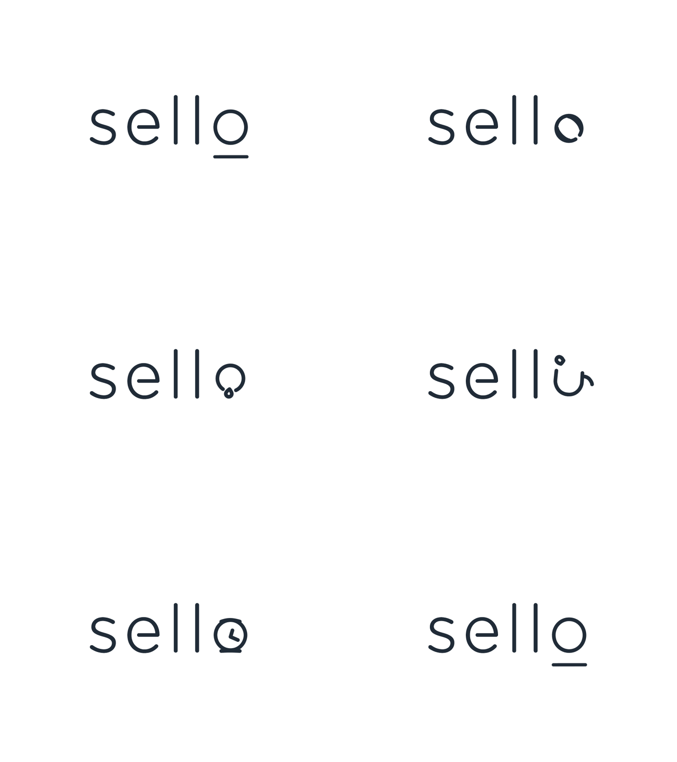
- The Sello logo creatively represents the diverse range of products on its platform. From a ball to a ring to headphones to a clock, the logo showcases various items commonly found on the Sello marketplace, providing an immediate visual indication of the platform’s offerings.
- The logo’s animation is subtle yet dynamic, making it more memorable and appealing to viewers. Animation also helps showcase the brand’s versatility and adaptability in a constantly changing digital landscape.
- Additionally, the logo’s animation is seamlessly integrated with the rest of Microsoft’s branding, creating a cohesive visual identity across all their products and services.
- The logo’s simplicity makes it easy to recognize and remember, crucial for effective brand recognition and recall.
What sets this video apart
Employing the smooth transition from the letter ‘O’ to the articles on the platform makes this logo animation unique and captivating.
18. The Doorman
Designer Musique cleverly disguises a door within a gentleman’s tophat to reveal an animated logo for The Doorman design is simple yet memorable.

- The animation sequence features a horizontal line that lets a man’s face appear with a hat in which a door gets opened, which aligns with the brand’s focus on security and protection.
- Moreover, the black and white color is simple yet impactful to convey sophistication and elegance.
- The animation itself is smooth and seamless, providing a visually pleasing experience for viewers. Additionally, the logo’s integration with the brand’s name, “The Doorman,” reinforces the idea of efficiency and ease of use.
What sets this video apart
The animated Doorman brand logo is a great example of a unique and innovative approach. Using abstract imagery and creative typography gives the logo a distinct personality.
19. Facebook | Meta
After the rebranding from “Facebook Inc.” to “Meta Platforms” in October 2021, a new logo for Meta was introduced, which garnered a mixed response from the design community.
- The animated logo leaves behind the blocky wordmark Facebook users easily recognize. It introduces a vibrant blue gradient and a 3D continuous looping shape that resembles a ribbon with two-coiled ends. The logo symbol is meant to illustrate the “infinite horizons in the metaverse,” as the design team at Meta puts it.
- The animated Facebook | Meta brand logo features a continuous loop structure overlapping circles depicting infinity and representing the company’s infinite services. This simple yet sophisticated design makes it easily recognizable and memorable for viewers.
- The animation of the logo is also unique, creating a cohesive and engaging experience for viewers by including 2D and 3d animation with typography.
- Furthermore, the recent rebranding of Facebook to Meta has added an additional layer of uniqueness to the brand logo. The transition from Facebook to Meta is represented through the logo animation, showcasing a shift towards a more expansive and innovative focus.
What sets this video apart
The animated Facebook | Meta brand logo stands out from others due to its sleek design, dynamic animation, and adaptability to various platforms and devices. It effectively represents the company’s identity and services while showcasing its commitment to innovation and growth.
20. Delfina Foundation
The Delfina Foundation represents the interests of its residents through a bold and modern monogram. The logo shifts from a prominent underline to nothing during its cycle and then reveals the letters “D” and “F” again.
It has a utilitarian feel and is quite simply effective. Delfina Foundation aims to make art more accessible to artists by providing straightforward functionality.

- The animated logo features how a geometric shape can define the whole brand quickly.
- The logo’s animation’s black and white colour usage immediately grabs the viewer’s attention.
- It effectively captures the essence of the organization while standing out as a visually striking and memorable piece of branding.
- Finally, the animation style is also distinct, using 2D elements to create a sense of depth and complexity. This approach aligns with the Delfina Foundation’s mission to support artists exploring new and innovative approaches to art-making. Overall, the animated Delfina Foundation brand logo.
What sets this video apart 👍
The employment of just letters with bold typography creates a bold impression in front of the viewers. The Bold lettering here commands attention and suggests strength, confidence, and authority.
21. Giant Owl
A different approach is taken by the Giant Owl animated logo regarding its rotation. The forms rotate like film reels in these circular forms, blinking like owl eyes.
The movement is an essential part of animation; otherwise, you’d be unable to recognize those shapes. With animation, logo designs can be represented from angles that would not be possible with static art. Let’s take a look at the logo to understand more.
- The animated Giant Owl logo is playful and engaging, capturing the viewer’s attention by using the owl’s eyes as the video reel in the animation form.
- By reflecting the brand’s dedication to delivering optimal outcomes, the seamless animation of the reels resembling the owl’s eyes produces a constant motion that results in a smooth visual effect.
- The Giant Owl logo animation is designed to reflect the brand’s name and identity, which is essential for effective marketing.
What sets this video apart
The metaphorical and visual combination of the brand name and the brand work in this 5-second logo is a simplistic yet ultimate visualization.
Set your foot in creating attractive animated logos in video production
In this blog, I shared some of the best animated logos of various companies and organizations that have caught people’s attention. Animated logos are here to stay and are one of the must-have marketing strategies of every company, brand, or organization, which the best logo animation apps or production companies can produce.
Need a hand in animating your brand logo? Contact us to get assistance from our professional logo designers.
Frequently Asked Questions
What is a logo animation video?
How do I make a motion logo video?
What is logo animation concept?
How can I animate my logo?
Dive Into our Client Testimonials
Listen to business owners like you share how we’ve helped them grow. Your story could be next!


The webdew team is very supportive, they provide us with thoughtful suggestions.
We contracted webdew to build our new website. And let me tell you, they did a fantastic job. Their team was really easy to communicate with.”
The webdew team is very supportive, they provide us with thoughtful suggestions.
We contracted webdew to build our new website. And let me tell you, they did a fantastic job. Their team was really easy to communicate with.”
The webdew team is very supportive, they provide us with thoughtful suggestions.
We contracted webdew to build our new website. And let me tell you, they did a fantastic job. Their team was really easy to communicate with.”
“We worked with Chehak over the past several months to create a series of animated videos for an academic planner that we produce. And from the very beginning, she was absolutely professional and a pleasure to work with.”


6x
We helped clients multiply their website conversion rates through strategic design and UX optimization.
20%
Our marketing campaigns led to a 20% uplift in customer engagement across digital channels.
2K+
Delivered over 2,000 qualified leads through targeted funnels and smart automation.
120+
Our video content has earned 120,000+ views, driving brand awareness and audience retention.
“I recently had the pleasure of working with Chehak on a video demo project, and I was thoroughly impressed with her services.”


Additional Resources
Access expert tips, trends, and strategies designed for small businesses. Stay ahead of the curve and make informed decisions with our comprehensive resources!


