The design, large images, and other elements addon on the landing page extensively affect this loading time.
Your landing page is the first thing potential customers see, so making a great first impression is essential. An eCommerce landing page optimization can get you better results.
Hence, a well-designed landing page can increase your chances of converting visitors into customers.
In this article, we've compiled 15 best e-commerce landing page examples to inspire and help you stand out.
From stunning visuals to persuasive copy, these examples showcase the best eCommerce landing page design practices.
So, let's dive in and check how you can adapt these examples to create a landing page that converts!
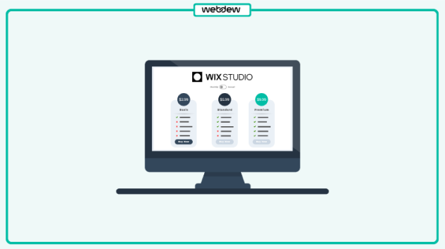
15 best Ecommerce Landing Page Examples to convert
The best eCommerce landing page inspirations -Livwatches. Livwatches has crafted a landing page that is visually stunning and highly effective in converting visitors into customers. Here's why:
The Livwatches landing page has an eye-catching design with bold and modern aesthetics. These designs will grab your attention in one go. The high-quality product images are prominently displayed, with clear calls to action to encourage visitors to explore the products further.
The Pricing information is easy to understand. The visitors can quickly decide whether the product is within their budget. Using bold text and contrasting colours makes the pricing information stand out and grab attention.
The Livwatches landing page includes customer testimonials near the bottom of the page. The social proof will give potential customers confidence in their purchase decisions. This helps build trust with visitors and encourages them to make a purchase.
The landing page highlights the unique selling points of Livwatches for building a strong value proposition.
The landing page clearly displays their commitment to sustainability and ethical production. This helps to set them apart from competitors and gives customers a compelling reason to choose Livwatches over other options.
The Livwatches landing page is polished and professional, with clear branding and a consistent design aesthetic. This helps to establish trust with visitors and positions Livwatches as a credible and trustworthy brand.
Hence, Livwatches has done an excellent job crafting a visually appealing landing page. Its landing pages are user-friendly and optimized for conversions. If you have a conversion goal for your eCommerce landing page, Livwatches is worth checking out! ⌚
99design is one of the unique eCommerce landing page design examples for eCommerce owners to inspire from.
The layout is incredibly clean and user-friendly. Everything is organized in a way that's easy to navigate so that customers won't get lost in a sea of products.
The product images are top-notch. They're high in quality and showcase the items in the best possible light. The descriptions of the products are also clear and concise, so customers know what they're getting.
99design is not just about the products but also about the experience. And 99designs knows how to create an experience. The landing page has a sleek and modern design that draws you in. It's visually appealing and gives off a vibe of quality and sophistication.
Its call-to-action buttons are prominent and impossible to miss. It encourages the target audience to take action. The audience will take a prompt by adding something to their cart.
In today's world, more and more people are shopping on their phones, so your landing page must look just as good on a mobile device as on a desktop. And 99designs has nailed it.
Hence, 99design got everything you need to create a top-notch landing page that will make your products shine. Learn about the eCommerce web design problems that you may encounter while building one.
GoPro's e-commerce landing page is a great example of showcasing your products in an engaging and visually appealing way. The page is designed to make you feel like you're already out there capturing amazing footage with your GoPro.
From the moment you land on the page, you're greeted with stunning photos with antique value propositions that show off the product's capabilities.
Scrolling down the page, you'll see more examples of the footage you can capture with a GoPro. The discounts will definitely be going to grab your attention.
GoPro has done a great job showing the lifestyle and experiences of owning a GoPro. The landing page reflects how GoPro creates a community around the brand. It's not just about buying a camera; it's about joining a community of adventure seekers who love to capture their experiences.
The page is also easy to navigate. The list at the top of the page lets you quickly find the product you're interested in, whether it's the latest GoPro camera or accessories to enhance your footage.
A section dedicated to “Looking for more Options” even suggests products based on your browsing history.
Thus, if you're looking for inspiration for your eCommerce landing page, look no further than GoPro.
One of the best eCommerce landing page examples to get inspiration for your store. Here is why you should leverage its design,
Hellofresh's page is clean and easy to navigate.
The top of the page features a clear, concise headline that tells you exactly what the site is about – “Take the Stress out of meal time.”
As you scroll down, you will get into the reasons why you choose HelloFresh. You can further also check their plans to know what's inside.
The recipes of delicious meals and their Insta clicks will induce you to click and explore more about them.
Hellofresh's landing page does a great job of addressing potential objections. They have a FAQ section covering everything from dietary restrictions to delivery schedules, which helps alleviate potential customers' concerns.
Hence, the Hellofresh landing page persuades you with its mouth-watering delights and converts you with its transparent purchasing process.
Solostove grabs your attention with its stunning visuals. The key features include,
The hero image features a beautiful fire pit in use, immediately prompting and setting the tone for the rest of the page.
Scrolling down, you're greeted with clear and concise product categories.
The landing page focuses on several calls-to-action (CTAs) that prompt visitors to shop directly from the page.
Another impressive aspect of the Solostove landing page is urgency and scarcity. They highlight the specific discounts on the products. This can be a highly effective tactic for boosting conversions.
The page also allows you to sign up for their newsletters for regular notifications of available products. This is a classic way to keep visitors engaged with the brand. Click here to subscribe to our monthly newsletter.
Hence, this high-converting landing page is a great example of how to create an effective eCommerce landing page. It's no wonder that Solostove is a leader in the fire pit market!
Athemes landing page copy is effective for e-commerce brands. The page will draw your attention from top to bottom. Let me tell you why,
Athemes's landing page is sleek, modern, and easy on the eyes. The layout is well-organized, with all the essential information visible.
Athemes' eCommerce landing page pays attention to displaying the details. From carefully crafted product descriptions to high-quality product images, every aspect of the page has been thoughtfully designed to create a seamless shopping experience.
Other than the aesthetics, Athemes' landing page also boasts some great functionality features. For example, the search bar is prominently displayed and works like a charm. Its product categories are neatly organized and easy to navigate.
Athemes knows how to motivate its customers to take action with bold, attention-grabbing CTA buttons that encourage visitors to add items to their cart or check out.
Hence, Athemes' eCommerce landing page is a great example of what an effective eCommerce landing page should look like. With its appealing web design, intuitive navigation, and smart functionality features, it's no wonder that Athemes has become a go-to destination for online shoppers.
The landing page for Skullcandy is an excellent example of a successful marketing strategy. The page takes the product the company is already known for and provides a new perspective. Let us check out its major features:
Despite focusing solely on the technical specifications of the headphones, the content emphasizes the brand's mission of boosting mental health. This customer-focused approach provides a value proposition that appeals to the target audience.
The page benefits from the use of contrasting tones between the font, background, and images. The black-and-white colour scheme gives the page a sleek, modern feel that aligns with the brand's image.Â
The page also includes an instant discount of 65% on MmRP, another intelligent marketing tactic. By offering customers an instant discount, the brand can increase the value of each sale.
Finally, the opportunity to bundle products is another smart tactic that helps increase each sale's value.
Dribbble's is an excellent example of a landing page for eCommerce to get inspiration. It's a great example of how to design a landing page that looks good and delivers a seamless user experience. Here is why,
The design is modern and sleek. The page has a clean, minimalistic, visually appealing layout.
The use of white space is done well and makes the page feel spacious and uncluttered. This helps customers to focus on the products being showcased.
The products on the page are presented in a desirable manner. The images are large and high-quality and showcase the products in an enticing way. This makes the products look more appealing to customers and can increase sales. Using a carousel also allows more products to be showcased in a smaller space.
Dribbble's navigation menu is easy to use and lets customers quickly find what they're looking for. The search bar is prominent and easy to access, which is helpful for customers who know what they want.
The call-to-action buttons are apparent and make it easy for customers to take action. The “Signup to continue” element button is placed correctly. It makes it easy for customers to sign up for more.
The filtering system is also very efficient, making it easy for customers to narrow their search results.
So, if you're looking to design an eCommerce landing page that's both beautiful and effective, you can take inspiration from Dribbble.
Envato Elements is a great example of an eCommerce product landing page because it has everything you need to make a unique first impression on potential customers. Let us look at its sophisticated features,
Envato Elements' landing page has a clean and visually appealing design that draws you in.
The well-organized layout makes it easy to navigate and find what you're looking for.
Using vibrant colours and high-quality product images creates an inviting atmosphere that makes you want to stay and explore more.
Envato Elements focuses on providing detailed information to the users. From the typography to the product descriptions, the things are carefully crafted to enhance the user experience.
The CTA buttons are prominently displayed throughout the page. It helps users add products to their cart quickly and make a purchase.
Envato Elements is an excellent eCommerce landing page example that combines aesthetics and functionality. It's a well-designed page that's easy to navigate, highly effective, and visually appealing at converting visitors into customers.
You can check out Envato Elements if you're looking for inspiration for your eCommerce landing page.
ThemeForest is a complete package of an excellent eCommerce landing page example. Let us check out why ThemeForest is an excellent example of a successful eCommerce landing page:
ThemeForest's landing page has a beautiful design that makes it unique and stunning. The page is visually appealing and easy to navigate. It has clear calls to action that guide users toward making a purchase.
ThemeForest displays a wide range of products in a clean and sophisticated way. It includes several eCommerce themes and templates catering to different industries and niches. This makes it easy for visitors to find what they're looking for and discover new options they might not have considered before.
It provides a straightforward checkout process. It is crucial for reducing cart abandonment rates and ensuring a smooth customer experience. And ThemeForest is winning it all. ECommerce brand uses this landing page idea to convert visitors to their online store.
ThemeForest is a fantastic example of a successful eCommerce landing page. They've created a page that converts visitors into happy customers by focusing on design, product selection, social proof, and user experience. ?
WordPress has a user-friendly interface and endless customization options, which makes it the impeccable platform for eCommerce businesses of all sizes.
WordPress high-converting eCommerce landing pages are an excellent example of what a great eCommerce landing page should look like. Let us check out how,
WordPress eCommerce landing pages are straightforward to navigate. It typically has a clear and concise layout. The users can easily find what they're looking for. Whether it's a specific product or information about the business, everything is organized in a way that makes sense.
WordPress eCommerce landing pages also have a clean and modern design. It often uses high-quality images to showcase its products that instantly grab the visitor's attention.
“The load more themes” button loads only fewer themes to maintain confusion-free user environments.
WordPress landing page contains all the elements to offer users what they want. This is crucial for any eCommerce business looking to increase its online visibility and drive traffic to its website.
You can take some cues for your landing page from the WordPress landing page. It is highly effective for e-commerce brands.
Blue Apron is a food delivery service platform that has mastered creating an engaging and effective landing page. It uses clear visuals on the landing page to promote and highlight its products. Here's why:
The landing page is highly authentic. The high-quality images of their delicious meals make your mouth water and create a strong desire to try their service.
Its landing page is concise and to the point. Blue Apron highlights the key benefits of their service. It includes easy-to-follow recipes and sustainable sourcing of ingredients without overwhelming the user with too much information.
The landing page is user-friendly and easy to navigate. The call-to-action buttons are prominently displayed, and the user can quickly and easily sign up for their service. Since landing pages are designed for conversion-centric goals, be sure to include the best CTA possible.
Hence, By focusing on strong visuals, clear incentives, concise messaging, and user-friendliness, they have created a landing page that converts visitors into customers. So, getting inspired by the Blue Apron landing page example is better.
Naboso is the best landing page example for your eCommerce site.
It is well-designed, easy to navigate, and has a clear call to action.
When you land on its page, you're greeted with a beautiful banner image showcasing its products in action.
The image is high-quality, and the colors pop – it immediately grabs your attention and draws you in.
Scrolling down the page, you will love its authentic organization. With clear organization, it has significantly emphasized making things easy for visitors. Each section is clearly labelled and provides a brief overview of what you can expect to find.
The use of images will fascinate you to stay for a long. It has many high-quality product photos showing its products from different angles. This makes it easier for customers to visualize the products and see exactly what they're getting.
Naboso's landing page covers customer reviews displayed prominently on the page, which helps build trust with potential customers. Seeing positive reviews from other customers can be a powerful motivator for people to purchase.
But perhaps the best thing about Naboso's landing page is its clear call to action. They have a prominent “Shop Now” button that's easy to find and stands out from the rest of the page.
The buttons are highlighted to help users know where they need to click next. Naboso has made the best use of the page elements from top to bottom of the page.
Hence, if you own a food eCommerce business, you can take cues from Noboso's landing page. Naboso has done a great job showcasing its products in the best light.
Doodly's landing page is an excellent eCommerce landing page example. From the moment you land on their page, you're greeted with a fun and playful design that reflects the creative nature of their product.
This promotional landing page uses animated visuals to showcase its product.
They use engaging animations demonstrating their product's work and highlighting its unique features. This helps create a sense of excitement around their product, which can be a powerful motivator for purchasing.
The real-time proofs make it clear that Doodly is a trusted and reliable choice. The page is targeting to reassure visitors that they're making a good choice by considering Doodly.
Doodly's landing page uses attention-grabbing headlines and subheadings to communicate the benefits of its product. It also covers clear calls to action that make it reliable for visitors to take the next step.
It provides clear information about their pricing and features, which are easy to follow. It allows visitors to make an informed decision.
Marley Spoon is one of the top e-commerce landing pages. Look forward to its crucial features,
It is clean, organized, and easy to navigate, making it simple for users to find what they're looking for.
The page starts with a beautiful hero image, showcasing delicious food that makes your mouth water. It's the perfect attention-grabber and sets the tone for the rest of the page.
The headline is also concise and clear, letting visitors know what MarleySpoon is about. Marley Spoon's headline showcases: “Get the Balance Back.”
It has a straightforward CTA at the top that stands out and is easy to find. It's also compelling, inviting users to “Start Cooking Now” and start. The button is placed in a prominent position, making it easy for users to take action and sign up.
The page is also visually appealing, with high-quality images that show off the product and make it look tasty and tempting.
The landing page is focused on mobile responsiveness, making it easy to use and navigate on any device. This is crucial since more and more people are accessing the internet from their mobile devices.
Hence, Marleyspoon's eCommerce landing page is one of the best practices to follow for your custom landing pages.
Are you ready to grab these best practices for your eCommerce Product Page?
If yes, you can implement these best practices for your eCommerce product page. It will positively impact your sales and customer engagement.
Optimizing your product page with high-quality visuals, detailed descriptions, and customer reviews can provide a seamless shopping experience that encourages visitors to buy.
Remember to regularly update your page and stay on top of current design trends to ensure your eCommerce business remains competitive.
So, believe in yourself, take insights from the above best eCommerce landing page examples, and break the floor.
An eCommerce landing page is a webpage designed to induce visitors to take a particular action, such as signing in for any service or making a purchase. Its goal is to drive sales and revenue for the business by providing a clear value proposition, high-quality visuals, social proof, and a solid call to action.
To create an eCommerce landing page, you need to define your target audience and their requirements, determine the goal of your landing page, and create a compelling headline and subheadline that communicates your value proposition. Use high-quality visuals and social proof to build trust with potential customers, and design a clear call-to-action that prompts visitors to take the desired action. Simplify the checkout process to diminish cart abandonment, and test and optimize your landing page based on visitor behaviour and conversion rates.
Yes, eCommerce needs a landing page. It is an essential tool for eCommerce businesses to drive sales and revenue online. A perfect landing page can help increase conversion rates, build trust with potential customers, and simplify the checkout process, resulting in higher sales and revenue for the business. Without a landing page, eCommerce businesses may struggle to effectively communicate their value proposition and encourage visitors to take the desired action, leading to lower sales and revenue.
A landing page is a page that encourages visitors to take a single, specific action. At the same time, an eCommerce website is a complete online store with multiple pages and features designed to sell products or services to customers.
Prerna Oberoi is an Associate Content Writer specializing in content creation, copywriting, blogging, social media content, and content strategy. Her expertise helps businesses engage and connect with their audience through compelling and strategic content. Prerna's passion for effective communication and creative storytelling shines in her writing, offering valuable insights to enhance brand presence and engagement.
Similar Posts
Wix Website Examples: 21 best options to see in 2025
Squarespace Website Examples: 19 best websites to look into in 2025
Top 18 Best WordPress Website Examples you need to know in 2025
11 Inspiring Facebook Ad Examples that Drove Real Results
19 best Shopify Store Examples for your online store in 2025
How to Boost Conversions with Facebook Retargeting Ads in 2025
Web Design Trends for Conversions: What should you know in 2025
Best Web Hosting Providers to try in 2025