We typically respond the same day

.png?width=630&name=download%20(8).png)
What comes to your mind when you think of famous brands like Puma, Mcdonald’s, Apple, and Starbucks?
Most likely, you will get a picture of their logo in your mind. You might also be identifying certain things based on their logos.
These logos will be used on their website, which acts as an address for any business today. Whenever someone visits your website, purchases your products, or looks at your marketing materials, they will see your logo. It doesn’t matter how big, or small your brand is—the logo will help define you from everyone else.
So, it is of utmost importance that your web design logo should pack a punch—tell a story and make an impression. It should immediately communicate the characteristics of your brand and appeal to your target audience.
In this blog, let us discuss a few tips to help you design a website logo for your business that people will not forget.
Tips for designing a Logo that packs a punch
To create an effective logo, there are some website logo design elements you will want to understand. You can make a logo yourself when you know what you are going after.
Take Note of your Target Audience
To create a custom logo that can enhance your brand identity, you need to understand who you are as a brand. If your logo is going to speak to your audience, you have to know who they are.
You can’t assume you know what your audience wants or needs. Start by building buyer personas.
Choose 3-5 of your top customers who have distinctive perspectives and roles. Give each buyer a name to help distinguish the different people. To create your buyer persona, you will need to define each buyer:
You will use these personas to better dial in on your branding before you create your own AI logo. These buyer personas will also help you communicate your needs if you outsource content or marketing tasks in the future.
Scope out the Competition
Before getting started on the logo design, you should check out the competition. You may find that your competitors are already using the imagery or shape you imagined in your head. Part of a good branding decision is to make sure you aren’t going to be confused by your competition.
Only generic brands and knock-offs try to look like popular brand that already exists. For a long time, Pepsi-Cola looked a lot like Coca-Cola. It added blue to the logo in 1950 and then dropped the “Cola” to go with just Pepsi in 1961.
This has helped define it as a very different brand of soda. Other generic brands tend to look like those two leaders, like Sam’s Cola, RC, Shasta Cola, Cola Soda, and others.
You want to be the leader and have your own identity. So, learn what the competition is doing so you know how to be different with your colors, imagery, and font choices.
Research and get Inspired
Look at other brands that are attracting your target audience in other industries. Your target audience doesn’t just need the product or service you offer—they are out there buying other things. So, seek out the brands and influencers who are popular with your crowd.
Look at the aesthetic that appeals to your audience before nailing down your branding. Take a look at our library of logo designs made according to client requirements in the video below.
You may also find inspiration in your own products, services, area, industry, and more. Jot down notes for all imagery, colors, artistic styles, and characteristics that you may want to incorporate in your branding and showcase in your logo.
Need more inspiration? Browse logos at sites like Behance, Pinterest, Logo of the Day, Logo Gala, and Logopond.
Decide on the Type of Logo
There are a number of different logo types you can go with. Consider what kind of logo you want to use before you start figuring out the specifics of style, imagery, color, and other details.
Experiment with Typography
The font you choose is very important in a professional logo design. It has to be easy to read, even when very small. It needs to feel professional, well-spaced, and consistent.
The font pair in logo design also needs to have visual characteristics that support the nature of your brand. Do not choose a soft and flowy font if you are an edgy company appealing to a more aggressive and active crowd.
You don’t choose an old-timey font if you are a cutting-edge tech company. Ignore using a technical font if you are a nature-based brand.
Try different fonts to see how they play with your colors, composition, and imagery. You can narrow it down to your top 3-5 choices before moving on to finalizing your unique logo design.
Ultimately, you will probably only want one font in your logo, though some brands will use two fonts to help set apart the brand name from the initials, letterforms, or emblem details. Harley-Davidson and Heineken are examples of logos using two fonts in their designs.
Explore Color Combinations
Color is going to be a huge factor for your brand as a whole—and it’s all defined by the logo. Use your logo to establish the colors that represent your brand.

In most cases, you will want between 1 and 3 colors, though some brands do use more. You will want to know the meaning behind colors before you decide which ones best represent your brand.
Here is what colors are identified to represent:
Make sure your colors help you stand apart from your competitors. Similar color combinations can make it harder for your audience to recognize your brand right away.
Creating Multiple Versions helps!
Don’t just go with one version for your logo. This is an amateur design move.
An expert graphic designer will often start with tons of little thumbnails to test out ideas and very loose compositions. Then, the designer (or client) will choose the top 3-5 versions to be turned into larger roughs. These start to show the color use and more specific composition.
You may find yourself doing many versions before you find the perfect logo. There are almost always major design flaws in the first several versions until you work out the bugs.
What if you swap out one color for a slightly more saturated version or a different hue altogether? What if you move that logotype up just a couple of pixels? What if it is curved to follow the design or straight across to contrast against it?
There are so many options when you customize your logo. You can easily explore slightly different versions when you create a logo in Photoshop.
You can even use free online logo generators or online logo makers to design free logos in minutes. With lots of AI tools, and free logo creator like DesignEvo or logo maker tools available online, you can design a logo on your own as well.
But we recommend this only if you are on a tight budget. Professional designs made by a design studio or logo designers with exclusive design tools can surely stand out from the ones made using a free logo maker online.
Choose the Right File Format
Designing a brand logo is one thing, but you also need to ensure your logo files are saved in the right format.
The correct format will allow for high-resolution colors, translucent backgrounds, and scalability, making the images seem great on any device. For online use, logos work best in JPG, PNG, or SVG format.
All logos are vector or raster files. Vector files feature accurate mathematical points, thus they can be scaled. Despite scaling up, the image keeps sharpness and resolution.
Raster is pixel-based. When you enlarge an image too much, it becomes blurry and blocky. The best results come from using vector files to save and distribute huge image files.
Also, we recommend using the PNG file format as it has a lot of advantages. Downloading your logo in PNG makes it easier for you to resize it without compromising on its high quality. It is ideal especially if you have put design skills to create the perfect logo that has sharp features.
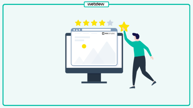
Ask for Feedback
You can even test your versions on your audience or stakeholders. This can be tricky because some people will always have something to say, while others will be fine with just about anything.
It’s best if you can get the opinion of a professional. You might also consider polling your audience or testing your logo options out with A/B testing. Make sure to do a check wherever you use it, be it on documents, business cards, websites, apps, etc.
Sometimes, it’s hard to be honestly critical of your work when you’ve been looking at it for a long time. Professional designers spend hours and hours in group critiques for their projects during graphic design school. Getting fresh eyes on your design will help you make sure you are communicating the things you want to express with your logo.
Have you made your Logo Yet?
Logo creation and finalizing your company logo can be tricky, but these tips will help you start off on the right foot. You can even make a logo for free using a free logo generator nowadays.
Quick reminder: The best logo for any business would be a custom logo design that aligns with the brand identity/ company values.
Even if you are creating a new logo or making changes to your existing logo styles, once you’re done, you will have a much stronger brand. Still, if you have any queries, don’t hesitate to contact us.
Dive Into our
Client Testimonials
Listen to business owners like you share how we’ve helped them grow. Your story could be next!


.svg)

“Recently we reached out to Webdew for a website inside of HubSpot and they also did some mocking automation for us.”

“Webdew team was quite honest and quite easy to work with in terms of taking feedback implementing it, showing that it doesn’t happen again and things like making sure that it meets our expectations.”

“We worked with webdew to help us build our HubSpot website and they did an amazing job with it. They were very quick.”

“webdew has helped us optimize the sales and marketing processes, and this is automating a lot of processes.”

“Hi everyone my name is Kara and I work as a channel consultant at HubSpot Singapore. I’ve been working closely with webdew agency”

“Hi my name is Christian from OpenDoors Mortgage team and I’m in the mortgage business and just trying to work on new projects and kind of incorporating HubSpot for my operations”

“I’m one of the technology directors for Travelopia. We are the largest experiential travel company in the world. We’ve engaged webdew recently, not recently, it’s been about a couple of quarters now.”
“We worked with Chehak over the past several months to create a series of animated videos for an academic planner that we produce. And from the very beginning, she was absolutely professional and a pleasure to work with.”


6x
We helped clients multiply their website conversion rates through strategic design and UX optimization.
20%
Our marketing campaigns led to a 20% uplift in customer engagement across digital channels.
2K+
Delivered over 2,000 qualified leads through targeted funnels and smart automation.
120+
Our video content has earned 120,000+ views, driving brand awareness and audience retention.
“I recently had the pleasure of working with Chehak on a video demo project, and I was thoroughly impressed with her services.”
.svg)

Additional Resources
Access expert tips, trends, and strategies designed for small businesses. Stay ahead of the curve and make informed decisions with our comprehensive resources!