Breaking Boundaries: Best SaaS Website Design Trends to know in 2026
Table of contents
Have you ever wondered why some websites are effortless to navigate while others leave you bewildered?
Enter the transformative website design trends of 2024 – tools that designers employ to turn pixels into a cozy experience akin to your favorite sweater.
But have you ever considered why it is more important for SaaS websites to follow these trends?
The reason is simple: for a SaaS business, its website serves as its primary and defining identity. The business’s existence could be at risk if the website lacks a modern, attractive, clear, easy-to-navigate appearance – all while being fun.
Vibrant colors act as friendly guides, animations add excitement, and seamless responsiveness isn’t magic but responsive design brilliance.
So if you want all of this and something more, scroll down the blog till the end to know about the trends in detail and ideas to use them in your website.
8 best SaaS Website Design trends that one should know of
In the ever-evolving landscape of digital experiences, staying ahead demands a keen understanding of the latest trends.
Here are eight best SaaS website design trends that have the potential to revolutionize user engagement and drive unparalleled success.
1. Minimal use of colors
Create that attracts and not distracts.
This new style of using just a few colors is the apt solution to the sentence above and isn’t only about making things less complicated. It changes how things look and feel, making each color important and making people feel strongly connected to what they see.
Example
When you check out this Dropbox website example, you’ll see how using fewer colors can make a big difference.
It grabs people’s attention and helps them concentrate on the text, which acts as a call to action by using darker colors in the background. It employs small amounts of green, red, and light blue to create a distinct appearance.

We’ll explore the benefits of using a limited colour palette to enhance website visitor focus. This approach guides users seamlessly through the SaaS product usage without distractions.
- Amplified impact
Utilizing a minimal colour palette lets your website immediately capture the user’s attention. The deliberate choice of colours creates a visual impact that stands out, making the design more memorable and engaging.
- Emphasized elements
A natural hierarchy emerges through minimal colours, allowing key elements and information to stand out. This hierarchy enhances navigation efficiency, guiding users to important sections and actions, ultimately improving their overall interaction with your website.
- Emphasized elements
Harmonious focus
The limitation in color variety promotes a sense of harmony throughout the design. With fewer colors vying for attention, the content takes center stage, enabling users to engage more deeply with the information and enhancing the website’s overall usability.
- Emphasized elements
Clarity & elegance
A simple and minimal color scheme imparts a sense of professionalism and elegance to your website. The straightforward design approach adds clarity, making it easier for users to understand the content and trust the information presented.
2. Dark mode
Nowadays, using dark mode on your SaaS website isn’t just something that’s popular for a short time. It’s a smart decision that really affects how people feel when they use a website.
The dark mode is when the background of a website is dark, and the words and pictures are bright. It’s not just about looks – it’s about making the website work better too.
Example
Talking much about dark mode here would not be the right decision. Thus providing you with an apt example of Spotify’s dark mode would let you understand what we were trying to say above and how it can benefit you in the ways mentioned below.
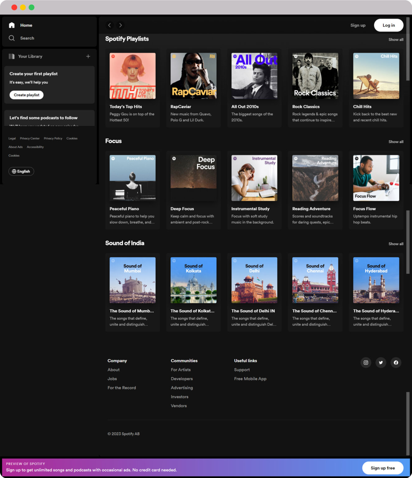
As we discussed, dark mode isn’t just about how it looks. It has hidden benefits that make things better. When we’ll explore these benefits, we’ll find that it improves how users enjoy using a device and how well the device works.
- Reduced eye strain
Online being the only mode through which a user can access SaaS products, Dark mode’s soft lighting minimizes eye strain during prolonged screen use.
It offers a more relaxed and comfortable browsing experience, especially during nighttime sessions or extended work hours.
- Energy conservation
For devices with OLED or AMOLED screens, dark backgrounds consume less power. This results in improved battery life for mobile users, aligning with sustainable efforts and enabling longer usage between charges.
- Visual impact
The striking contrast between vibrant content and dark backgrounds creates an attention-grabbing effect that presents modern sophistication. This visual interplay captivates website visitors or product users and highlights key elements.
- Enhanced user experience
Dark mode optimizes browsing in low-light settings by reducing glare and excessive brightness. This ensures a smooth and pleasant experience, regardless of the ambient lighting conditions.
- Modern aesthetic
Embracing dark mode lends your website a sleek and contemporary look, resonating with users who appreciate elegant visuals and stylish presentations.
- Screen adaptation
Dark mode seamlessly adapts to various device settings, allowing users to effortlessly switch between environments without compromising on readability or aesthetics.
- Accessibility
Dark mode enhances accessibility and inclusivity by catering to users with visual impairments or sensitivity to bright light. This thoughtful design choice ensures that a wider audience can interact with your website comfortably.
- Brand identity
When implemented in the right way, the dark mode aligns with your brand’s identity. It provides a consistent and memorable experience that reinforces your unique identity.
3. Animated graphics
In computer design, moving pictures called animated graphics are like cool stories.
When these pictures move, they take us on a fun adventure that makes us interested and involved.
This adventure we’re discussing about shows how animated graphics make stories come alive. It also represents how using things on the computer feels like reading an exciting storybook.
Example
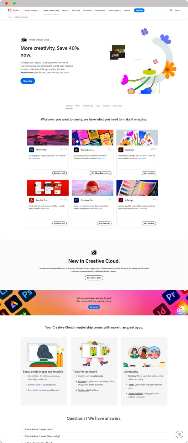
Adobe’s foundation is rooted in creativity; therefore, one might expect such animations to be utilized. However, it’s important to clarify that this assumption is entirely incorrect.
By providing this illustration, we aren’t suggesting that you need to possess an exceptionally creative mindset when incorporating animations. Rather, we aim to redirect your attention to how animations can captivate an audience and how effectively they’ve integrated the essence of their SaaS product.
If you prefer a minimalist approach, feel free to use minimalism when crafting such graphics. Nonetheless, always ensure that the viewer comprehends the purpose of your product. For instance, if you offer time-tracking software, you could display a small arrow icon by clicking the start time button.
Here are some points that can help you understand that why following this trend would benefit you.
- Enhanced user engagement
Animated graphics have the ability to seize the user’s attention in a captivating manner. By guiding users through a visually dynamic journey, these animations motivate them to delve deeper into the website’s offerings. Thus, driving increased exploration and interaction.
- Fluid user experience
The seamless transitions facilitated by animated graphics create a harmonious and mesmerizing flow as users navigate the website.
Consistent background colors contribute to this enchanting journey, ensuring a smooth and enjoyable user experience that is both visually pleasing and functionally efficient.
- Coherence and unity
Animated transitions between content blocks establish a sense of coherence and unity across the website.
These gentle progressions create connections between different sections, facilitating a holistic understanding of the information presented and fostering a more cohesive user experience.
- Vivid storytelling
Motion breathed into graphics lends depth and dimension to the act of storytelling. The incorporation of animations allows for intricate ideas and concepts to be conveyed with a remarkable degree of clarity, creativity, and engagement, transforming static content into a vivid narrative.
- Interactive exploration
Animated graphics entice users to interact with the website, driven by the allure of movement. The dynamic nature of these animations prompts users to take a proactive role in their exploration, resulting in a deeper and more immersive interaction with the content and features of the site.
4. Content filtering and sorting
When we talk about making things on the computer, it’s really important to make sure people can do what they want. Content filtering and sorting are like magic tools that help people choose what they want to see.
These tools make it easy for people to look at things in their own way. They help you find what you like and make using a SaaS thing feel special, like it’s just for you. It’s all about making things more fun and easy for each person.
Example
Merely discussing content filtering and sorting wasn’t sufficient. Hence, we’ve provided an example from Zapier’s website, offering a visual aid to facilitate your comprehension.

Knowing about content filtering and sorting was fine, but knowing the ways in which it would be more beneficial is the need of an hour. Let’s shed some light on those points.
- Time efficiency
Content filtering and sorting mechanisms enable users to access content that aligns with their interests.
This efficient access saves time. Thus, ensuring that users can engage with the SaaS product more productively without the frustration of sifting through irrelevant information.
- Reduced cognitive load
These mechanisms play a pivotal role in simplifying decision-making processes for users. Content filtering and sorting structures and presents information in an organized manner. This reduces the cognitive load on users, making it easier for them to make informed choices.
- Discoverability
Imagine a SaaS platform offering a wide range of features or content. Some of these features might be lesser-known “hidden gems” that users might overlook when presented with a mass of information.
When these magic tools help people find cool stuff they might not have seen, it makes them really happy.
Imagine finding a hidden treasure – it’s like that! When people find things that surprise them and make them excited, they have a better time using the SaaS product, and it feels even more fun.
- Multi-dimensional exploration
Content filtering and sorting allow users to explore the same content from different angles or viewpoints. This means they can slice and dice the available information in various ways to gain a comprehensive understanding of the offerings.
For instance, they might filter products by price range, user ratings, or specific features. It empowers them to make more informed decisions based on their specific needs and preferences.
- Increased conversion rates
When people see things they like and want, they usually want to do something about it – like signing up or buying. Content filtering and sorting are like helpers that show people things they’ll like.
When the computer shows stuff that’s right for them, more people will want to do what the website wants. This helps the SaaS service get more successful.
- Guided decision-making
In a vast sea of content or options, users might feel overwhelmed when deciding.
Think of content filtering and sorting like having a map or guide on the computer. They help you find things when there are a lot of choices.
For example, these tools can help you quickly find what you want if you’re looking to buy something online. It’s like having a friend who knows exactly where to look, so you don’t have to search everywhere. They make it easy and fast to decide what to pick.
- Accessibility and inclusivity
Not all users have the same needs or preferences. Some may need specific types of content or have limitations that affect their interaction.
Using content filtering and sorting is like making the computer do things just for you. It helps you find exactly what you want, even if you have special needs or things you really like.
For example, if you’re looking for something specific, these tools help you find it quickly. It’s like having a computer that understands you and helps you feel comfortable. This way, everyone can use the website and feel happy about it.
5. Large heading fonts
Typography is like the style of writing that helps us understand things better. Using big and bold letters in the heading is the special design element to make words stand out and grab our attention.
In this journey, we’re going to learn about how using big heading fonts is like making strong and important statements. It’s not just about the words – it’s about making them powerful and easy to understand. We’ll see how these big letters quickly tell us what a product is all about and why it’s great.
Example
What do you notice or read first in the picture below? Please answer honestly.
If we were asked the same question, our answer would be “Easy scheduling ahead.” We think this way because that’s the main thing that caught our attention right away.
This shows how using big letters for headings make them stand out more than other text.
Next, Calendly focused on showing how it can help visitors. This makes the information not only easy to see but also lets people know exactly how Calendly can be useful to them.

- Immediate attention
When large heading fonts are employed, they demand the viewer’s attention right away. This ensures that crucial information, such as key features, benefits, or announcements, is instantly noticed and absorbed by users.
In a world where attention spans are limited, large headings help capture users’ focus promptly.
- Effective communication
Big and important headings help you quickly tell people what your SaaS product is all about. When you use these bold words, it’s like showing the most important things right away. This saves people time and helps them understand your product better.
It’s like giving them a clear picture of what they can find, so they want to know more and look around.
- Memorable impressions
The visual impact created by large heading fonts leaves a lasting imprint on users’ memory. When things look really big and important, people are more likely to remember them. This helps them remember what your brand is like and recognize it later.
It’s like when you see a big picture, you don’t forget it easily, and that’s how people will remember your brand too.
- Guided user experience
Large headings act as navigational signposts, guiding users through your website or platform.
When you put these big headings in the right spots, you can make people notice important things like buttons to click, important news, or important parts of your product.
It’s like showing them the way to the important stuff. This helps them understand better and use the website more easily. It’s like having a map that guides you so you don’t get lost.
- Brand identity
The unique and distinctive use of large heading fonts can contribute to shaping your brand’s identity. When you use the same special fonts in a special way all the time, people will recognize it as your brand. It’s like having a unique style that only you use.
This makes your SaaS product different from others and makes your brand’s personality and message stronger and clearer. It’s like having a map that guides you so you stay aware of the situation.
- Aesthetics and modernity
Big headings make your website look cool and modern, just like the latest trends. When you use these big letters, it makes your website look fancy and stylish.
It’s like wearing a stylish outfit that everyone notices. This tells people that your SaaS product is new and follows the latest designs that people like.
6. Micro-interactions
Think of designing a website as creating a beautiful picture with many small pieces. Sometimes, the tiniest things can have the biggest effect. Micro-interactions are like these tiny parts that bring a website to life.
They are little animations that happen when you do something, like clicking a button – like button, call to action button, share button, etc. or moving your mouse.
This exploration is like an adventure into these micro-interactions. It’s like finding out how these small animations are much more important than just looking nice. They actually make you feel a strong connection with the website.
Similarly, when a user hovers over a navigation menu item on the homepage of a website or landing page and it gently expands, revealing sub-categories, it’s more than a visual effect. It provides instant feedback, guiding users and simplifying navigation, transforming a potentially overwhelming experience into an intuitive journey.
Example
This video shows what exactly micro interactions are and how they have been used on the website of Loops.so
You’ve learned about micro-interactions, and now it’s time to grasp their effectiveness and why incorporating them is a smart decision.
- Enhanced user engagement
Micro-interactions infuse a sense of dynamism and responsiveness into the interface. These subtle animations capture and retain users’ attention, encouraging them to explore further and engage more deeply with your SaaS platform.
The interactive nature of micro-interactions creates an environment that’s visually appealing and emotionally compelling.
- Direct interaction
Micro-interactions provide users with a tactile and immediate sense of interaction. When users see elements respond to their actions with subtle animations, it mimics the physical world’s cause-and-effect, making the digital experience more intuitive and engaging.
This direct interaction bridges the gap between the virtual and physical realms, enhancing user comfort and familiarity.
- Feedback and guidance
Micro-interactions serve as a form of real-time feedback, offering users cues and guidance as they navigate through the interface.
These small animations can indicate a successful action, an error, or state change, helping users understand the consequences of their actions and facilitating seamless navigation.
- Delightful user experience
The incorporation of micro-interactions adds an element of delight to the user experience. When users encounter these small but engaging animations, they experience moments of surprise and enjoyment.
This infusion of delight contributes to an overall positive emotional connection with your SaaS product, making interactions more memorable and pleasurable.
- Memorable branding
When thoughtfully designed and aligned with your brand’s identity, micro-interactions contribute to creating a distinct and recognizable brand image.
These subtle touches become associated with your product, setting it apart from competitors and establishing a unique and memorable brand presence in users’ minds.
7. Alternating the placement of text and images
The trend you mentioned involves strategically alternating the placement of images and text on each horizontal row. By employing such layout, SaaS websites not only breaks away from conventional designs but also creates a sense of rhythm and flow as users navigate through the website.
To maximize the impact of this layout, SaaS companies must pay careful attention to the quality of both images and content. High-resolution, relevant images that resonate with the content’s message are crucial. Likewise, concise, meaningful text that complements the images ensures that users experience a coherent narrative.
It’s important to maintain a balance between visual appeal and usability. While the alternating layout can be attention-grabbing, it should not compromise the ease of reading and navigation.
Responsiveness across devices, particularly mobile devices, should also be a priority to ensure a seamless experience for all users.
Example
What are your impressions when you examine this homepage of Time Doctor that embodies the design trend we just discussed?
Had someone inquired, we would have described it as symmetrical, easily comprehensible, and possessing an organized appearance, all achieved within a space-efficient layout.
Likewise, we aim to explain how this trend has elevated the visual appeal and design of website.

The alternating placement of images and text serves multiple purposes:
- Visual interest
The dynamic interplay between images and text adds visual intrigue, making the website more appealing and encouraging users to linger on the page.
- Easy readability
Placing text adjacent to relevant images enhances readability by providing context and visual cues that guide users through the content.
- Storytelling
The split layout enables SaaS companies to convey narratives and concepts effectively. By combining imagery with textual explanations, intricate ideas become more comprehensible.
- Brand identity
Thoughtfully chosen images in alignment with brand aesthetics can reinforce the brand’s identity and create a cohesive online presence.
- Data presentation
In SaaS websites that handle data-driven content, this layout can serve as an effective tool for presenting statistics and information alongside explanatory text.
8. Usage of different colors per block
The growing trend of using different colors for distinct content blocks on SaaS websites is a strategic design choice that goes beyond aesthetics.
This approach, often referred to as “color block” or “color section” design, holds the potential to significantly enhance user engagement, convey information more effectively, and strengthen brand identity.
Example
In this illustration of Kissflow’s homepage, you’ll observe the strategic use of black and white colors to create distinct sections or blocks for varying content.
This approach establishes both symmetry and a visually appealing design, thereby elevating the overall website aesthetics and facilitating effortless content differentiation.

Let’s delve into the value and impact of this trend:
- Visual hierarchy
The use of different colours per content block instantly establishes a clear visual hierarchy. Each colour signifies a new section, making it easier for users to comprehend the content’s organization and navigate through the website seamlessly.
- Content differentiation
By assigning distinct colours to various content blocks, SaaS websites can categorize and differentiate information.
This is particularly useful when presenting a variety of features, benefits, pricing tiers, or case studies. Users can quickly identify and focus on the specific content that interests them.
- Storytelling and flow
Colors have the power to evoke emotions and associations. Using a strategic color palette that aligns with the content’s narrative, SaaS websites can guide users through a visual journey that resonates with their emotions and enhances the storytelling experience.
- User-friendly scanning
In today’s fast-paced digital world, users tend to scan content before committing to a thorough read. The use of different colors per block captures attention and encourages users to engage more deeply with the content, resulting in improved comprehension.
- Brand recognition
Utilizing a consistent color scheme that reflects the brand’s identity across different content blocks reinforces brand recognition and consistency. When users associate specific colors with your brand, it contributes to a strong visual memory and fosters a deeper connection.
- Visual appeal
Beyond functional benefits, the use of vibrant and harmonious colour combinations adds a level of visual appeal that draws users in. This can lead to extended time spent on the website and reduced bounce rates.
- Call-to-action emphasis
Strategically applying a different colour to calls-to-action (CTAs) can make them stand out prominently within their respective content blocks. This increases the likelihood of user interaction and conversion.
Why your SaaS Website should follow these web design trends?
As someone who’s really good at SaaS (software) stuff, knowing about cool new website designs can make your online presence super awesome.
Your SaaS website should get on board with these new design ideas because they can make a positive change for you.
1. Captivating First Impressions
Your website is the gateway to your SaaS kingdom. Dark mode, minimal colors, and animated graphics aren’t just aesthetics; they are tools to craft an arresting first impression.
The attraction of dark mode draws visitors in, while minimal colors create focus, and animated graphics weave a captivating narrative that compels exploration.
The result? Instant user engagement that sets the tone for an extraordinary user journey.
2. Seamless User Experience
The synergy of continuous backgrounds, content filtering, and micro-interactions ensures an intuitive and gratifying user experience (UX).
By allowing users to effortlessly navigate your SaaS offerings and interact with the platform, you’re fostering an environment of trust and user loyalty.
3. Clarity and Impact
When potential customers land on your SaaS website, they seek clarity and instant comprehension.
Large heading fonts cut through the noise, delivering a bold and impactful message that resonates. These bold proclamations succinctly convey your SaaS product’s essence, making it easier for users to grasp its value proposition.
4. Personalization Redefined
The digital era is one of personalization and AI-driven personalization is the beacon guiding users to their desired destinations.
By tailoring content and recommendations, you speak directly to individual needs and aspirations, forging a connection that feels tailor-made and deeply resonant.
5. Aesthetic Elegance, Functional Excellence
Minimalism, vivid color schemes, and bold typography are more than design choices; they exemplify the marriage of aesthetic elegance and functional excellence.
These trends create a visual harmony that’s pleasing to the eye and amplifies your message’s effectiveness, transforming visitors into engaged users.
6. Future-Proof your Digital Brand
Embracing these web design trends isn’t a fleeting affair; it’s a strategic investment in the future. By adopting forward-thinking design principles, you future-proof your SaaS brand, ensuring its relevance and appeal in an ever-evolving digital landscape.
Ready to be trendy while designing your SaaS Website?
As we look at this year’s best SaaS website design trends, it’s like we’re going on an adventure.
Designers are mixing art and technology to create great and awesome websites. These designs are like superheroes – they can change and adapt to fit all kinds of devices and make everyone happy.
Remember, these trends aren’t about today. They’re like a sneak peek into the future of website design.
Also, if you want a professional agency to makeover your website design and give your SaaS business a chance to attract more customers, contact webdew.
Frequently Asked Questions
What is SaaS Web Design?
SaaS web design involves crafting user-friendly and visually appealing websites tailored for Software as a Service (SaaS) companies. It aims to effectively showcase the features and benefits of products of SaaS, focusing on intuitive user interfaces, seamless integration of the SaaS application, and engaging graphics.
How to Create a Website for SaaS?
To create a SaaS website, start with thorough market research to understand your audience and competition. Outline the website’s structure, choose a user-friendly content management system (CMS), design with a modern layout and consistent branding, and present SaaS features clearly. Ensure responsive design, integrate calls-to-action, and optimize for search engines based on user feedback and metrics.
Is SaaS an IT Product?
Yes, SaaS is an IT product. It’s a cloud-based software distribution model. SaaS brands are companies that offer software solutions hosted in the cloud. Examples include Salesforce and Microsoft 365, providing subscription-based services across industries like CRM, project management, and more.
What are SaaS Brands?
SaaS brands are companies that offer cloud-based software solutions accessible over the internet. Examples include Salesforce, Microsoft 365, and Shopify. They provide diverse tools for tasks like CRM, project management, and e-commerce, delivering convenience and scalability to users without traditional installation and upkeep.
Dive Into our Client Testimonials
Listen to business owners like you share how we’ve helped them grow. Your story could be next!


The webdew team is very supportive, they provide us with thoughtful suggestions.
We contracted webdew to build our new website. And let me tell you, they did a fantastic job. Their team was really easy to communicate with.”
The webdew team is very supportive, they provide us with thoughtful suggestions.
We contracted webdew to build our new website. And let me tell you, they did a fantastic job. Their team was really easy to communicate with.”
The webdew team is very supportive, they provide us with thoughtful suggestions.
We contracted webdew to build our new website. And let me tell you, they did a fantastic job. Their team was really easy to communicate with.”
“We worked with Chehak over the past several months to create a series of animated videos for an academic planner that we produce. And from the very beginning, she was absolutely professional and a pleasure to work with.”


6x
We helped clients multiply their website conversion rates through strategic design and UX optimization.
20%
Our marketing campaigns led to a 20% uplift in customer engagement across digital channels.
2K+
Delivered over 2,000 qualified leads through targeted funnels and smart automation.
120+
Our video content has earned 120,000+ views, driving brand awareness and audience retention.
“I recently had the pleasure of working with Chehak on a video demo project, and I was thoroughly impressed with her services.”


Additional Resources
Access expert tips, trends, and strategies designed for small businesses. Stay ahead of the curve and make informed decisions with our comprehensive resources!


