Marketing graphic design is all about connecting and inspiring a brand’s products. In other words, it refers to the visual artwork created individually for advertisements.
Motion graphics videos for marketing can benefit brands as they have an element of motion that will capture the audience’s attention and present it in an appealing way.
Not only that, but all the materials created need to stake to the company’s visual specification, which is usually used fairly with advertising graphic design and varies because one of its purposes is to sell products and services. Marketing and design need to go hand in hand.
You create attractiveness in your brand through marketing, and design helps you visually convey your brand. Before a marketing plan, you need to start with the basics of brand instruction. These represent the beginning of every design team’s marketing material.
Without direction, it will be hard for your company to convey what you wish to effectively. An excellent design advertisement is more than just your company’s logo, font, page layout, or images you use in the same flow.
The crossover connects your variety to your customers and performs as a trust creator. If you imagine it, the design constitutes the face of your identification in many ways, so it is just about using impressive images and refreshing graphics.
In advertising, you write clear copy and choose the best way possible. However, it can’t be called a success if it doesn’t reach the edge.
When we speak about design, you can make an impressive ad with best one of the best graphic design tool Designcap. But if it does not get people’s attention, it doesn’t happen to make any sense. That’s why smart marketing needs to be merged with serious design.
In this blog, we will share some marketing graphic design tips that you can utilize to blend your advertising and design for your brand’s or organization’s growth.
Marketing Graphic Design Tips
1. Have a Clean Design
For instance, if you do not have an identification that’s totally admired so far, you would want to use a good marketing design to organize your status on the market.
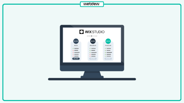
The mantra you should follow is simple – not too much text and not too many illustrations in the same banner. Too much text and illustrations will result in a complicated banner that no one wants to see.
One thing you can do after producing a visual that is extremely crushed with elements is to ask yourself if all of them are required in the design. That should help you fix what you need to replace to make your design and make it clean and viewer-friendly. For a quick and efficient way to create polished designs without the hassle, consider using tools like Canva, Adobe, and DesignWiz where you can easily streamline your ideas into professional visuals that grab attention.
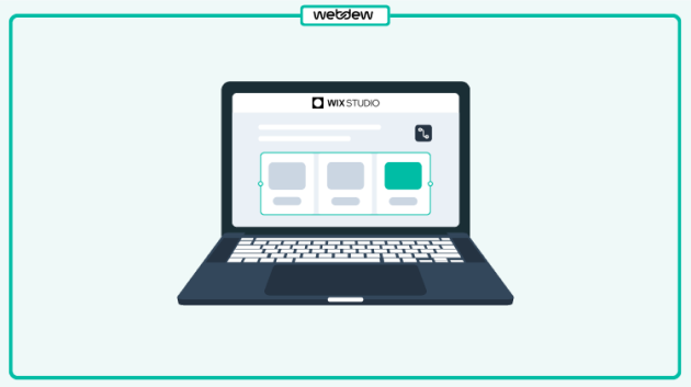
2. Use of Contrast
You first need to catch their interest before getting someone’s recognition and attracting them to your vision. Contrast has the ability to make your graphic stick out when you meet online.
You can use size, colour, alignment, repeating, closeness, whitespace, and texture to produce contrast in your design. The right quantity can make your advertisement materials much more attractive to your viewers.
There are some things you can use when exploring contrast on your graphics:
To highlight a point, make it more important than the other component in your vision.
Ensure that the colours you use in a poster resonate with the feeling you want to convey to your viewer.
Alignment can build the composition in design, and it will assist you in reading out the value of a component.
With repetition, you can design recognition for specific parts of your banner. Components that are near jointly have something in common, so you must consider accessibility when doing this.
The value of whitespace can’t be stressed enough. It should be used sufficiently to avoid viewers missing out on the details of the design.
Viewers are expected to react to an advertisement with an appearance background, such as dirt. This is because as they visualize it, they can relate to the smell and feel of it.
3. Limit the Types of Fonts
You can access a bundle of great fonts when we use an online design tool such as Creator. Because of this, you could be convinced to utilize as many of them as possible in your graphics, which is not the best task.
If you do not want to use just one font, then you should choose many font variations to make the divergence between them apparent. You have a font that speaks for your profession, but if you want to play with your illustrations, you should notice one that goes closely with the main font.
If you are working on a design to sell ebooks and other digital products, you can use different font sizes to guide your readers to anything you wish to highlight.
4. Apply different Size Fonts
Using one font for all your illustrations, you can create clear effects by playing with the font size. Move with a large size when you want to highlight a particular message.
Another point will be to see how a specific font view is in bold and italics. You would want to make sure it looks pleasing and legible.
5. Uses of Exact Colour
Colour theory is necessary for an advertisement graphic design that affects transformation. It is critical to learn it because it lets you decide how your consumer will respond to marketing communication based on the colour you use in your poster.
If you choose to outsource graphic design, collaborating with skilled professionals can ensure that the use of colour aligns with psychological principles, maximizing the impact of your marketing efforts.
The mindset of colour is all about merging art and science. That is why you need to imagine the reaction you will like from your spectator and find the best mixture between your brand’s colours. This certainly will help you attain your goal.
6. Use Lines
Being simple as they are, lines are an exceptionally flexible design detail that does more than connect dots. It can be long, short, curved, dotted, non-dotted, straight, horizontal, vertical, diagonal, solid, dashed, thick, or thin. You can increase your communication and create impressive visuals by correctly using this component in your graphics.
How can you utilize lines to expand the visual attraction of your imagination?
Organize the information by separating or grouping elements.
Unique types of lines can be used to reproduce quality.
Guide the view to control sections that provide main details.
Create the vision of motion with curved lines.
Furthermore, make a declaration using different measurements of the lines. Feel free to do as much as you can with lines and experiment with ideas to create impressive graphics.
All set to follow the Best Marketing Graphic Design Tips?
Advertisers speak about how useful marketing is, while designers speak about how valuable design is. Instead of endless debates, the focus should be on how teams can support creative marketing design.
Through this blog, we tried to shed some light on the coexistence of advertising and design. We hope this helped you understand that these are not competitive departments. Most importantly, we believe in open and transparent communication between marketing and design and in using the proper tools that are likely to smooth this connection.
I hope the marketing graphic design tips help you blend your designs from the marketing and advertising perspective. Designs need not be just illustrations. It can be animations, motion graphics, etc. Videos are one of the best choices for marketing.
Are you thinking of where to begin your marketing design? Be it video marketing services or strategy, webdew can be the best solution for you. Contact us!
Frequently Asked Questions
What is a marketing graphic designer?
A marketing graphic designer is a professional who specializes in creating visual content for marketing purposes. They design graphics, images, and visual materials to effectively convey marketing messages, promote products or services, and engage with the target audience. These designers combine artistic skills with marketing knowledge to create visuals that drive brand recognition and attract customers.
Is a graphic designer part of marketing?
Yes, a graphic designer is often integral to marketing teams or departments. Graphic designers are crucial in translating marketing strategies into visually appealing materials, such as advertisements, social media graphics, brochures, and more. They help convey the brand’s message and values to the audience through creative and eye-catching visuals.
Is digital marketing graphic design?
Digital marketing includes various strategies and tactics to promote products or services online, and graphic design is vital to digital marketing. Graphic design creates digital assets like website graphics, social media visuals, email marketing templates, and online advertisements. It improves the visual appeal and effectiveness of digital marketing campaigns.
What are the duties of a marketing and graphic design?
The duties of a marketing and graphic designer typically include designing marketing collateral, such as brochures, flyers, and posters; creating digital assets for websites and social media; developing branding materials like logos and style guides, and collaborating with marketing teams to align visuals with marketing strategies. They also ensure that the brand’s visual identity is consistent across all marketing channels.
Dive Into our Client Testimonials
Listen to business owners like you share how we’ve helped them grow. Your story could be next!
Play Video
“Recently we reached out to Webdew for a website inside of HubSpot and they also did some mocking automation for us.”
Conrad T. WalzVice President, Ortholive
Play Video
“Webdew team was quite honest and quite easy to work with in terms of taking feedback implementing it, showing that it doesn’t happen again and things like making sure that it meets our expectations.”
Uday JoseManaging Director, Enate India
Play Video
“We worked with webdew to help us build our HubSpot website and they did an amazing job with it. They were very quick.”
Nishtha MaheswariCEO, Pinkpowerco
Play Video
“webdew has helped us optimize the sales and marketing processes, and this is automating a lot of processes.”
“Hi everyone my name is Kara and I work as a channel consultant at HubSpot Singapore. I’ve been working closely with webdew agency”
KiaraGeneral Consultant, HubSpot Singapore
Play Video
“Hi my name is Christian from OpenDoors Mortgage team and I’m in the mortgage business and just trying to work on new projects and kind of incorporating HubSpot for my operations”
Christian AmuraoFounder, OpenDoors Mortgage
Play Video
“I’m one of the technology directors for Travelopia. We are the largest experiential travel company in the world. We’ve engaged webdew recently, not recently, it’s been about a couple of quarters now.”
SreekandhTechnology Director, Travelopia
“We worked with Chehak over the past several months to create a series of animated videos for an academic planner that we produce. And from the very beginning, she was absolutely professional and a pleasure to work with.”
Veronica BishopContent Writer, Bishop Content Studio
6x
We helped clients multiply their website conversion rates through strategic design and UX optimization.
20%
Our marketing campaigns led to a 20% uplift in customer engagement across digital channels.
2K+
Delivered over 2,000 qualified leads through targeted funnels and smart automation.
120+
Our video content has earned 120,000+ views, driving brand awareness and audience retention.
“I recently had the pleasure of working with Chehak on a video demo project, and I was thoroughly impressed with her services.”
Matt KayCo-founder, Talem AI
Additional Resources
Access expert tips, trends, and strategies designed for small businesses. Stay ahead of the curve and make informed decisions with our comprehensive resources!


 We typically respond the same day


.svg)


.svg)