We typically respond the same day


For the last couple of years, website design has changed quite a lot. Thanks to technological advancements, things have changed a lot. For example, you will get excellent drag-and-drop website builder design.
Moreover, many website builders, especially Wix, use AI to create websites easily. You don’t need to worry about manual intervention. From customizable template to page creation, Wix ADI will take care of everything.
So, are you planning to use Wix? If so, you need to know the best Wix website examples. Read my guide as I share 13 excellent websites made using Wix website builder.
Top Wix Website Examples
Let me not bore you with a lengthy introduction. There are various Wix websites that will capture your attention. While some of them may not cater to your needs, most are highly recommended.
From personal blogs to business websites, these great examples will help you know what creativity looks like. When you go through my list, you will know how you can use different elements for your benefits.
1. Dopple Press
All the showcased Wix websites deliver an exceptional user experience, but the risograph printing studio Dopple Press truly stands out.

Its clean, spacious layout and vibrant color palette create a visually appealing and easily navigable web design. Designer Liv White collaborated with Velo to incorporate imaginative animations on every page, encouraging visitor engagement and showcasing a brilliant example of interactive design in action.
2. Sonja Van Duelman
Studio Sonja Van Dulmen’s one-page website is a visual treat, seamlessly incorporating animations, galleries, multimedia, and a playful approach to typography and fonts. The site maintains a cohesive flow despite its varied layouts, showcasing Sonja’s expertise in design and her ability to craft with perspective in mind.

Sonja’s creativity shines in her header design, which mimics a magazine cover by featuring one of her designs as the cover image. The website title is boldly placed in the center, aligning perfectly with a curve in the image, while anchor points on the right-hand side function as a table of contents.
Rabin highlights the effective use of Wix’s Strips and Columns, tools that create responsive, full-width elements. “It’s dynamic, experimental, and refreshingly different,” she remarks. “The creator explored various layouts, features, and typography styles, making the site anything but repetitive.”
3. Yantra
Unlike most restaurant websites, Yantra’s design prioritizes ambiance and emotional appeal over showcasing its food. The homepage captivates visitors with a full-bleed gallery of breathtaking images of the restaurant’s interior, offering a visual feast at every turn.

The online menu is thoughtfully organized with tabs for each section, ensuring a seamless browsing experience and avoiding the overwhelm of scrolling through a lengthy list. This human-centered design approach truly shines.
Additionally, the site incorporates the Wix Gift Card feature, making it easy for regular patrons to give e-vouchers to their loved ones—a thoughtful and convenient touch.
4. Noah Demeuldre
Noah Demeuldre, an art director with a rich portfolio spanning commercials, films, music videos, and TV, earns his place among the best websites thanks to his masterful use of video. His one-page site is a dynamic experience, constantly in motion.

Full-screen video clips showcase his work, while the reveal scroll effect adds an engaging touch, making the journey through the website as mesmerizing as the projects it highlights.
5. Daniel Aristizabal
From the moment you land on Daniel Aristizabal’s graphic design website, it’s clear he’s not only talented but also has an eye for great design. His use of various Wix tools—such as VideoBox, Hover Box, and website animations—creates an engaging and highly interactive experience for visitors.

Aristizabal’s portfolio site effectively showcases his latest projects, tells compelling stories, and captures leads. The full-page, organized layout provides a clear overview of his work, while strategically placed buttons at each corner offer easy access to his contact page and links to his Instagram and Behance profiles, ensuring seamless connectivity.
6. Noni Ceramica
With mobile devices driving 52% of global internet traffic, it’s essential to highlight a site that excels in smartphone usability. Noni Cerámica’s mobile website earns its spot on our best websites list by delivering everything users need in a compact, user-friendly format.

From a streamlined menu for effortless navigation to a prominent shop button for quick cart access and a chat feature for instant customer support, this site truly embodies exceptional mobile design.
7. Tiffany Cruz
Tiffany Cruz elevates her already stunning website with her thoughtful use of typography. By uploading a custom typeface to Editor X’s font library for her headings, she gave her modern design a distinctive and personalized touch.

Staying true to her graphic design expertise, Cruz paired this with a clean, familiar font for the site copy, ensuring a comfortable and accessible reading experience for all visitors.
8. BlinkMyBrain
BlinkMyBrain’s clever use of a favicon not only charms visitors but also reinforces its brand identity, earning it a well-deserved spot on our best professional websites list. A favicon—a small image displayed on the browser tab beside the site title—helps users quickly locate the site, even among dozens of open tabs.

BlinkMyBrain’s unique favicon, a cutout from one of the animation director’s clips featuring an elderly man flexing in an astronaut helmet, is both memorable and perfectly aligned with the brand’s creative spirit.
9. Mikaela Reuben
Mikaela Reuben’s website makes an impactful first impression with its header. Featuring a full-bleed GIF of the health counselor harvesting rhubarb from a garden, the header immediately conveys her holistic philosophy.

A standout feature is the sticky navigation bar, which transitions seamlessly: it displays white text without a background at the top of the page but shifts to a translucent off-white background with black text as visitors scroll. Additionally, a search bar enhances usability, making it simple for users to explore Reuben’s extensive collection of free recipes.
10. Ivy Chen
The next example you need to know is Ivy Chen. While there are many Wix website examples, Ivy Chen is my personal favorite. Parallax scrolling’s three-dimensional effect creates a sense of discovery, offering viewers a captivating and immersive experience.

Ivy Chen takes this technique to the next level with her innovative use of the effect to illustrate her design process. First, a sketch emerges, followed by the finished garment layered on top, and finally, a photo of a model sliding beneath the garment.
This sophisticated design approach highlights her remarkable talent as a fashion designer, illustrator, and graphic designer, making her website a perfect source of web inspiration.
11. Chico Santos
Chico Santos’ website layout is both original and user-friendly. On the left side of the page, Santos lists his projects in reverse-chronological order, which doubles as a navigation bar.

When a visitor clicks on a project, it appears on the right side of the screen. “It’s very simple and uncomplicated,” says Rabin. “I like how one side is sticky while the other scrolls—it’s a clever way to stay oriented as you browse through the images. It’s a smart solution.”
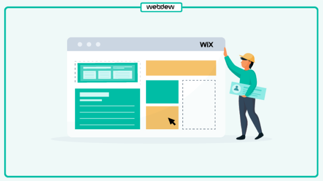
If you’re struggling with website layout, consider using website admin templates to help create your design seamlessly. Another approach is to understand your content and then choose a template that aligns with it.
For example, if you want a lot of text in your welcome section or second fold, look for a layout that complements your content and the message you want to convey, advises Dafna Rabin, Template Design Team Lead at Wix.com.
12. Christina Vanessa
Graphic designer and visual communicator Christina Vanessa clearly has an exceptional eye for aesthetics. The homepage of her graphic design portfolio offers a simple yet striking expression of her creative work and personality. A fullscreen looped video showcases her best pieces, with her name and disciplines elegantly displayed above.

Building on this strong first impression, Christina’s “Explore” page continues to impress with its thoughtful design features. The layout, composed of layered blocks, is complemented by a cohesive, neutral color scheme of soft creams, beiges, and grays, which creates a serene atmosphere. This calm ambiance is further enhanced by smooth animations, making the browsing experience both visually appealing and relaxing.
13. Sophie Westfall
Specializing in branding and UI/UX design, Sophie Westfall’s UX portfolio website is a strong showcase of her expertise in both fields. She has crafted a distinctive visual language for her career portfolio, using bright colors, geometric shapes, illustrations, and animations to create a memorable experience.

Subtle touches, such as an interactive feature image, add personality and a sense of wit to the site. One standout detail is the comic microcopy at the bottom, offering a refreshing take on the typical social media icons.
For example, she humorously describes her TikTok profile: “Honestly too Gen Z not to post on TikTok, but also too much of a perfectionist to post consistently,” adding a playful and relatable tone to her site.
14. Wendy Ju
The animation that greets visitors on Wendy Ju’s graphic design portfolio sets a perfect tone for the rest of the site. A smooth typing effect reveals her name, subtly introducing her work with precision and aligning with her minimalist aesthetic.

As you scroll further down the homepage, Wendy adds an engaging touch with a fun cursor interaction powered by Velo by Wix. This interactive element not only enhances the user experience but also adds a splash of color to the otherwise neutral color palette, making the site both visually appealing and engaging.
15. David Milan
Designer, art director, and hand lettering artist David Milan places his art at the forefront of his website. By keeping the header minimal and using a simple monochrome palette, he ensures that visitors’ attention is immediately drawn to his vibrant designs.

The gallery, which spans the width of the screen, makes up the bulk of the website. Using the Wix Pro Gallery, David has created a feed-like layout that invites visitors to scroll down, offering great usability.
This straightforward structure not only enhances the browsing experience but also allows for easy updates, enabling David to continually expand his design portfolio with new works.
16. Ryan Haskins
Brand designer and creative director Ryan Haskins’ portfolio website is full of surprises, beginning with the bold typography on his homepage. While mixing more than three typefaces is usually a design faux pas, Ryan breaks the rules with confidence, successfully creating a unique and effective visual hierarchy.

This daring approach sets the tone for the rest of the site, where his collage-inspired portfolio further reinforces his creative style. As you scroll down, Ryan’s works continue to impress, offering the same level of uniqueness, intrigue, and surprise.
While his full graphic design resume isn’t included, the ‘Bio’ section showcases his impressive client list and the accolades he’s received from various publications, essentially functioning as a resume within the portfolio.
17. By Experience
An energizing cobalt blue dominates the homepage of design agency By Experience, creating an immediate sense of dynamism. The fast-paced animated text on the top fold adds to the high-energy feel, with a self-assured, direct tone that invites visitors to get in touch and hire their expert services.

Unlike other online stores in this selection, By Experience combines their showcased work with testimonials from satisfied clients. This not only highlights their skills and past successes but also helps attract potential clients.
To make contacting them easy, the site features a floating menu icon in the top right-hand corner, which leads to an online form. Using a professional portfolio as a marketing tool is always a smart move.
18. Aling Wen Photography
Crafting a photography portfolio is akin to curating an art exhibition—it’s a personal reflection of the artist’s perspective, and thoughtful presentation is key to making it resonate.

Aling Wen’s website exemplifies this beautifully, with a dreamy, fullscreen portrait that spills over the edges, inviting viewers into the idyllic world captured in the photo.
Aling has organized her portfolio into sections, allowing clients to easily find samples that are relevant to their needs. The website’s design, featuring a graceful font, a lively logo, and a subtle color palette, perfectly complements the ethereal quality of her work. I particularly appreciate how she varied the layout throughout, ensuring each section feels like a fresh and unique experience.
19. Reut Chen
Textile designer Reut Chen has opted for a classic grid layout on her portfolio website, using geometric blocks that contrast beautifully with her organic, textured, and handmade works. The simple, distraction-free design allows her art to take center stage, ensuring that it stands out.

For those wondering how to create an eCommerce website, Reut’s website serves as a fantastic example. She breaks away from the grid with a featured project at the top of her homepage, drawing attention to her current focus.
This spotlight allows potential clients or collaborators to quickly understand the areas she is exploring. Tailoring your portfolio to showcase the type of work you want to pursue is a key tip for freelancers looking to attract the right opportunities.
20. T Sakhi
Sisters Tessa and Tara Sakhi design spaces inspired by the beauty of the human experience, and their interior design portfolio beautifully reflects this philosophy.

The site blends multimedia, images, and videos of urban architecture, with a captivating video background of blurred city lights that transitions into their work, immersing visitors in their artistic vision.
The website features an updated list of current projects and exhibits, keeping visitors informed about the duo’s latest endeavors. Additionally, the “About” section provides a personal touch, sharing their story and fostering a deeper connection between the artists and potential clients.
21. Rafael Varona
Berlin and Rotterdam-based illustrator, animator, and art director Rafael Varona showcases his impressive range of motion design on his animation portfolio website.

Specializing in intricate animated loops, Varona’s work takes center stage as visitors are greeted with a vibrant array of colorful, detailed clips. As you scroll through the homepage, his work continues to unfold in a grid layout, offering a front-row view of his creative universe.
The site includes minimal text, focusing instead on his stunning artwork. In the upper right corner, a menu link leads to his Instagram account, alongside a brief “About” section, allowing the work to speak for itself while offering visitors a glimpse into the artist’s world.
Ready to build a website using Wix?
Here you have it. Some of the best Wix website examples that can help you get started. Make sure you pay close attention to the design trends used in these website examples. This way, you will get more inspiration regarding what you should do and what you should avoid.
However, remember that every website built is unique and different. Thus, make your creativity juices flowing to come up with the perfect template for your website. Fortunately, Wix offers various eye-catching templates for better appearance and online presence.
I hope you found this blog informative. Do you have any other questions? Let me know in the comments below.
Dive Into our
Client Testimonials
Listen to business owners like you share how we’ve helped them grow. Your story could be next!


.svg)

“Recently we reached out to Webdew for a website inside of HubSpot and they also did some mocking automation for us.”

“Webdew team was quite honest and quite easy to work with in terms of taking feedback implementing it, showing that it doesn’t happen again and things like making sure that it meets our expectations.”

“We worked with webdew to help us build our HubSpot website and they did an amazing job with it. They were very quick.”

“webdew has helped us optimize the sales and marketing processes, and this is automating a lot of processes.”

“Hi everyone my name is Kara and I work as a channel consultant at HubSpot Singapore. I’ve been working closely with webdew agency”

“Hi my name is Christian from OpenDoors Mortgage team and I’m in the mortgage business and just trying to work on new projects and kind of incorporating HubSpot for my operations”

“I’m one of the technology directors for Travelopia. We are the largest experiential travel company in the world. We’ve engaged webdew recently, not recently, it’s been about a couple of quarters now.”
“We worked with Chehak over the past several months to create a series of animated videos for an academic planner that we produce. And from the very beginning, she was absolutely professional and a pleasure to work with.”


6x
We helped clients multiply their website conversion rates through strategic design and UX optimization.
20%
Our marketing campaigns led to a 20% uplift in customer engagement across digital channels.
2K+
Delivered over 2,000 qualified leads through targeted funnels and smart automation.
120+
Our video content has earned 120,000+ views, driving brand awareness and audience retention.
“I recently had the pleasure of working with Chehak on a video demo project, and I was thoroughly impressed with her services.”
.svg)

Additional Resources
Access expert tips, trends, and strategies designed for small businesses. Stay ahead of the curve and make informed decisions with our comprehensive resources!