It is fascinating how the human mind works. Have you ever wondered about the manner in which people take in their world visually?
In the 20th century, German psychologists Max Wertheimer, Kurt Koffka, and Wolfgang Köhler tried to find an answer to this question. They conducted a series of studies, and as a result, they developed the gestalt principles, which are a set of simple guidelines that explain how people see the world around them.
Proximity is considered to be one of the gestalt principles. This principle has a significant impact on the aesthetics of contemporary user interface design. In this blog, I will tell you what proximity means in Web Design and how you can use it.
What is Proximity in Web Design?
The concept of proximity refers to the elements that need to be ordered visually and the goal of achieving the least amount of confusion possible. It is important to separate contents that are not related to one another in order to highlight the absence of a connection between them.
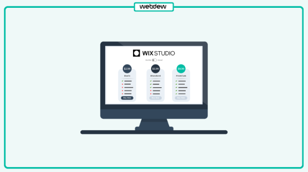
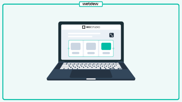
For instance, you must have noticed that the icons for several social media platforms have been grouped together and not spread apart on a website. It is more similar to a technique of putting everything in one location.
Layouts that use proximity to minimize visual ambiguity and promote comprehension are easier to understand. Proximity also aids in the structure of the website’s layout. The proper application of proximity has a significant and beneficial effect on the user experience.
Designers benefit from the proximity principle by being able to achieve major objectives like making layouts appear less cluttered and grouping together variables that are collectively connected.
How to use Proximity in Web Design?
White Space
Understanding the importance of white space in design is the first step in successfully adopting the notion of proximity in design.
The lack of white space in designs is a common issue. When it comes to user experience, white space can affect it just as much as the actual content on the page. White space directs the user’s gaze, generates contrast, and leaves a lasting impact on the user’s mind.
Through design, designers communicate the nature of the website. It can be through text and images. But an effective design is something that has well-organized white space which can boost the elements in a website.
Create a Visual Hierarchy
The structure of the website and the way content is organized and presented are the building blocks of efficient proximity. A designer needs to be able to construct an appealing visual hierarchy of content in order to accomplish this goal of effective proximity. It is essential to provide your website a clear visual hierarchy, so it is important to make efficient use of white space and arrange comparable elements together.
Grouping and further sub-grouping website parts is the best technique to keep the hierarchy in place. The user is better able to grasp where they have been and where they want to go as a result of this hierarchy, which also helps to express the objective of the website.
The fact that the user is able to see this indicates that they are aware of and comprehend where the pertinent information is stored, which indicates that you have successfully communicated the message and goal of the website.
Improve Content Comprehension
Content is king. For many products, content material is the motive why human beings begin to use them in the first place. Good clarity (the convenience with which a reader can recognize a written textual content) and legibility (the convenience with which a reader can decode symbols) are critical homes of product design.
Many elements can make a contribution to clarity and legibility, which include font family, font size, and textual content contrast. But the manner you shape content material on a web page additionally without delay affects content material legibility and clarity.
Readability can go through while a textual content is supplied with none formatting. By supplying content material in short, effortlessly scannable blocks—grouping sentences in paragraphs or sections and setting them apart with a chunk of whitespace—you assist customers test and study the textual content.
Have a Scannable Layout
Reading and scanning content that is structured in a hierarchy and categorized in a logical manner is made much simpler. When building its architecture and design, a website should take use of proximity so as not to overload users with content.
Therefore, despite the fact that it is relatively simple to put the concepts of proximity into practice on websites that have a limited amount of material, proximity is significantly more crucial on websites that have a great deal of content. As a result, you should check to see if your layout is simple, readable and scannable by the user.
Emphasize Certain Elements
Emphasis is one of the maximum vital concepts of user experience (UX) design. Giving precedence to precise factors or content material on a web page is one of the maximum not unusual place responsibilities for designers.
While designers can use many exclusive strategies to obtain proper consequences—which include making a detail large or including extra contrast—it’s viable to obtain the identical consequences with none alteration of the authentic detail. Instead, you could play with the quantity of poor areas across the detail.
There’s an immediate connection among poor areas and personal interest. The extra poor area you upload round and detail, the extra important it will become for the viewer. This takes place naturally—because the person’s interest could be guided in the direction of a detail with an extra poor area really due to the fact there’s not anything else in that place drawing their interest.
It’s really well worth bringing up that it is probably difficult to recognize which detail draws the maximum interest on an internet page. So it’s encouraged to apply an internet layout software program to create a prototype of your layout and validate it with the 5-2nd test.
Show your prototype to individuals who constitute your audience for 5 seconds, after which ask them, “What are the primary factors you may recall?” If they call a detail (or factors) which you need them to see, then you’re all good.
Guide the Viewer’s Eye through Content
The precept of proximity assist you to create a waft a good way to manual the viewer’s eye from one factor to another. By adjusting white space, you could effortlessly create focal factors or regions that clearly appeal to the user’s attention.
Creating focal factors begins off evolving with growing an internet layout grid a good way to let you surround layout factors (along with textual content, images, or practical controls) always inside the layout.
After you’ve got got a grid, you want to set up factors to manual customers via key content material sections. As you could see below, that is precisely what Evernote does with the aid of using pairing textual content blocks with illustrations. As a result, the viewer’s eye follows a zig-zag route as they scroll via this page.
Wrapping Up
Focusing at the relative distance among UI factors is vital whilst you layout for diverse monitors and resolutions. Design that appears right on big laptop monitors won’t appear right on tiny cellular monitors.
When your layout is scaled down to house smaller monitors, the spacing among factors may be minimized, which would possibly smash UI factors’ supposed relationships. It’s important to check your layout on diverse monitors and resolutions to see whether or not your layout scales well. It’s viable to apply Google Chrome Dev equipment to simulate cellular devices.
How to improve website user experience is also something you may want to know more about. Contact us if you wish to design or redesign your webpage.


 We typically respond the same day


.svg)


.svg)