Designing the perfect Header is a more bespoke process than you might think. As you create your website, keep in mind the Header is the first thing visitors will encounter when they land on your homepage.
Like all aspects of your site, it needs to reflect your brand and involve equal strategic and creative thinking.
Whether you’re starting from scratch or revamping a website, we’ve got a compilation of the best practices for website headerdesign that’s as smart and attractive as the rest of your website.
So let us see what we have in this article.
What is a Website Header?
A header is the top section of a website page. A fundamental title contains the logo and menus at the top of the website. A header always shows all the pages of the website consistently.
To put it simply, website headers are a modified version of headings found in a regular paper press. They are markings for titles and subtitles ordered correctly. These titles and subtitles appear in the page’s content in the <body> section and are also known as header tags.
When you use them, a given content is differentiated from the rest – the font is more prominent and bolded. Thanks to that, it’s easier for users to notice essential details on the website and get a general idea of what the content will be about.
It is used to give users a clear outline of your website’s content and invite them to go inside pages and view more. Just as important is its function as a navigational tool. As users move from one page to the next, a website header can present them with clear direction.
A website header always sets the tone for the complete website.
Standard Features of a Header
Moving back to a header as your visitors experience it, there are several standard features that just about every website has. These features make it easy for someone to navigate and identify your website.
Headers can also be fixed or floating. Fixed headers stay in place at the very top of the page; they are stuck in position and do not follow your browser’s viewport as you scroll down.
A floating header follows you as you scroll. This Header may change during the scroll, depending on the design, becoming more compact. This allows someone to quickly navigate to another area of the site after reading to the bottom of the page without scrolling back up first. For example, Brehm Roofing & Restoration – Ocala uses a floating header on their website to make it easier for visitors to access different services quickly.
Consistent header elements make the web a more user-friendly place. Websites can vary in design in virtually infinite ways, but by maintaining a core set of features, your site will be much easier to navigate.
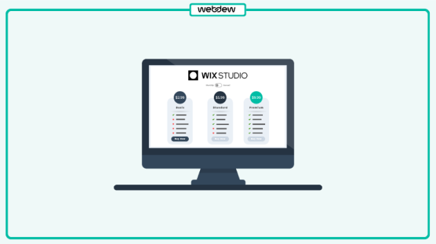
Call it an image, a trademark, or a brand identifier. A logo in the website header helps people remember your site for a longer run. It’s the first thing on a website a visitor sees and makes his perception about your site, and using a logo maker ensures that your logo is designed with precision, creating a strong, lasting impression.
If it’s designed rough, you could guess visitors will probably offer nasty remarks. Whereas, if you’ve done great work on it, then they’d surely continue on your website with admiration.
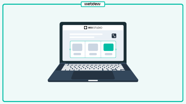
Navigation Menu
Another purpose of a header is to help website visitors explore the different areas of the site with ease. A website header is where your website’s navigation menus are available. Website’s navigation such as an About Us page, Contact us page are linking each to its designated location.
And you can achieve this by adding links or navigation links (the Main menu) if said precisely.
Navigation links are the website elements that users interact with mostly to reach certain pages.
You cannot miss them, and if you do so, you’ll put your visitors in an ocean or the desert.
Page Title
The page title typically occupies a space below the logo and navigation area of the Header. It may even take on a slightly different design from the rest of the Header, more appropriately matching the rest of the page’s body.
If you’re on the About page of a website, you might expect the word “About” to be printed in big, bold letters at the top of the page. This is technically part of the Header.
Search
Effective site search means better usability so that customers can find things more quickly. Websites with massive archives of content or inventories of products would greatly benefit from having a search bar in the Header.
This can be done by using the search box on your website header section. The search box should be just that, a package used to search the things on the website.
Shopping Cart (E-commerce Site)
If your website includes online products for sale, adding a shopping cart to the website header will simplify and improve your shopper’s checkout process. This helps visitors to purchase products online from your website easily.
Just about every eCommerce site has a shopping cart access point in the same place: the most upper-right corner of each page in the store. When someone is done browsing products and is ready to buy, having a consistent spot to access the shopping cart to check out is vital.
CTA (Call to action)
Every website has one action or goal that it’s driving visitors towards. While the website will include eye-catching calls-to-action throughout its pages, it’s a good idea to keep the CTA top-of-mind with visitors by putting it in the Header, too.
Your CTA should also be placed on the right end of the Header. Not only will this eye-catching link bring visual balance to the Header, but it also works as a helpful shortcut to conversion.
This is explained by the Serial Position Effect design principle, which says that people remember the first and last items in a series more than the others. So, when they’re ready toconvert, they won’t have to hunt down the CTA within the site’s content. They’ll know they can go directly to the Header to do so.
Login / Logout
Websites where visitors can become members often have login/logout features somewhere on the header bar. Login and Signup buttons help visitors to get on the website. If users are not registered with your website, there is also a signup button.
It’s common practice for the login button to stand alone and replace the user’s profile image with dropdown access to the logout shortcut. This image dropdown also gives the user access to their profile and settings. Google’s homepage is set up this way.
If there is a membership option on your website, this usually requires users to log in to the website. Therefore, you’ve got to have a clear place for them to log in, and the most obvious location for indicating a login form is at the Header of your homepage, where everyone can find it.
Language Selector
Suppose your website offers multiple versions based on language. If you want to showcase a single version of the site to users of different languages, then showcasing a language selector in the Header is worth all your efforts.
It helps language-specific users easily explore the site and allow you to cover more people from diverse locations and perspectives. Though, it would be best if you also integrated the language conversion for your website to do it effectively.
Moreover, when you add a language selector, go for the icon instead of text because users of different languages might not understand the menu text. However, with an icon, they can easily recognize it.
Let’s look at a Few Website Headers
Fixed Website Header
Persistent navigation bars, or in other words “sticky headers,” mean that the navigation follows you around the page while you scroll. This is now a web design standard.
Sticky Header is the one that fixes the menu to the top of the screen when the page is scrolled down. Today we can see many websites have a fixed Header. Fixed Header gives an attractive look to your website.
Make the Header fixed if it doesn’t violate your overall design concept. It’s a good idea for both desktop and mobile designs:
E-commerce websites — the cart is always in front of the user.
Service websites — the phone number or a CTA are constantly on display.
Fixed headers improve the customer experience, keeping users oriented and giving them more control.
Hidden Navigation (hamburger menu)
This is a solution increasingly used for website design. The hamburger menu is a small icon of three stripes on the top left or right side that displays the full menu when clicked. This technique is used by designers when they need to focus on the main screen.
Hamburger menus are used only in mobile view for responsiveness of Header. Still, It is also used on desktop view when Header has additional menu items or other information regarding the website.
From the point of site usability, this is a good option. Such a menu came from mobile design and is already familiar to users. The hamburger is suitable for promotional sites, where the main emphasis is on the high-quality presentation of the product using photos or videos.
This option might be less suitable for online stores since the customer needs to have a basket, selected products, and a search field in quick access.
Mobile (Responsive) Header
The Header should be correctly displayed on the desktop version of the website and the mobile one. So it has to be responsive and able to adjust well to any mobile device.
Responsive header design is an incredible thing in websites. But if you are not a web designer, you may be wondering what this term means.
Responsive Header scales its content and elements to match the screen size it is viewed. Responsive header design is used to avoid the unnecessary resizing, scrolling, zooming of the content in the header section.
The daily use of mobile devices led to website designs that look mobile-oriented even in their desktop incarnations. For example, the implementation of large hero images and hamburger menus has its origins in mobile format.
In Conclusion
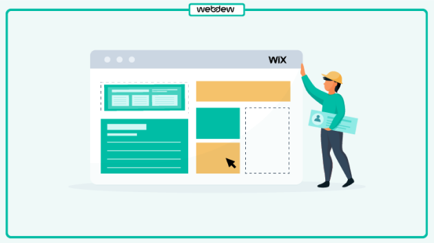
Your website header is a vital part of your visitor’s website experience. A functional, consistent header can make a world of difference in your site’s usability. Therefore, when designing a website, pay maximum attention to the Header.
You can do a lot to make your header look and feel unique to your site, and as long as the core standard features are in place, your content and design will shine through.
And one last best practice of a website header design: Make regular alterations to keep your website fresh and up-to-date.
To create a good header for your website, start by ensuring it’s visually appealing and consistent with your brand’s style. Include your logo for brand recognition and a concise, clear navigation menu with essential links. Consider incorporating a striking headline or call-to-action that conveys your website’s purpose. Use high-quality images, fonts, and colors that align with your brand’s identity to make the header visually engaging and memorable.
What should be in website header?
A website header should include key elements like your logo for brand identity, a navigation menu with essential links (e.g., Home, About, Contact), and contact information if relevant. It can also feature a search bar, a call-to-action button, or a headline that succinctly communicates your website’s purpose. Ensure it’s visually appealing, responsive, and consistent across all pages of your site.
What is heading vs header web design?
In web design, “heading” typically refers to the use of HTML tags to structure and format text content within a webpage. These headings help organize content hierarchically. On the other hand, “header” refers to the top section of a webpage, often containing branding elements, navigation menus, and other key information. While they share a similar name, they serve different purposes in web design.
Why are headers good for SEO?
Headers are beneficial for SEO because search engines use them to understand the content and structure of your webpage. Properly structured headers provide a clear hierarchy to search engine crawlers, making it easier for them to index and rank your content. Additionally, headers can improve user experience by making your content more scannable and reader-friendly, which can indirectly boost SEO.
Dive Into our Client Testimonials
Listen to business owners like you share how we’ve helped them grow. Your story could be next!
Play Video
“Recently we reached out to Webdew for a website inside of HubSpot and they also did some mocking automation for us.”
Conrad T. WalzVice President, Ortholive
Play Video
“Webdew team was quite honest and quite easy to work with in terms of taking feedback implementing it, showing that it doesn’t happen again and things like making sure that it meets our expectations.”
Uday JoseManaging Director, Enate India
Play Video
“We worked with webdew to help us build our HubSpot website and they did an amazing job with it. They were very quick.”
Nishtha MaheswariCEO, Pinkpowerco
Play Video
“webdew has helped us optimize the sales and marketing processes, and this is automating a lot of processes.”
“Hi everyone my name is Kara and I work as a channel consultant at HubSpot Singapore. I’ve been working closely with webdew agency”
KiaraGeneral Consultant, HubSpot Singapore
Play Video
“Hi my name is Christian from OpenDoors Mortgage team and I’m in the mortgage business and just trying to work on new projects and kind of incorporating HubSpot for my operations”
Christian AmuraoFounder, OpenDoors Mortgage
Play Video
“I’m one of the technology directors for Travelopia. We are the largest experiential travel company in the world. We’ve engaged webdew recently, not recently, it’s been about a couple of quarters now.”
SreekandhTechnology Director, Travelopia
“We worked with Chehak over the past several months to create a series of animated videos for an academic planner that we produce. And from the very beginning, she was absolutely professional and a pleasure to work with.”
Veronica BishopContent Writer, Bishop Content Studio
6x
We helped clients multiply their website conversion rates through strategic design and UX optimization.
20%
Our marketing campaigns led to a 20% uplift in customer engagement across digital channels.
2K+
Delivered over 2,000 qualified leads through targeted funnels and smart automation.
120+
Our video content has earned 120,000+ views, driving brand awareness and audience retention.
“I recently had the pleasure of working with Chehak on a video demo project, and I was thoroughly impressed with her services.”
Matt KayCo-founder, Talem AI
Additional Resources
Access expert tips, trends, and strategies designed for small businesses. Stay ahead of the curve and make informed decisions with our comprehensive resources!


 We typically respond the same day


.svg)


.svg)