Are you looking to increase conversions on your website? You might be surprised to learn that even small, strategic changes to your web design trends for conversions can have a major impact on your results.
While many marketers focus on strategies like Search Engine Optimization (SEO), Email Marketing, and crafting compelling lead magnets, the importance of website design often gets overlooked. Yet, according to an Adobe survey, people are more likely to engage with visually appealing content than with something plain.
Effective web design goes beyond aesthetics. By implementing principles of conversion-focused design, you can significantly influence your website’s ability to convert visitors into customers.
Best Web Design Trends for Conversions
So, you may ask, why should you know the web design trends in the first place? The simple answer is to stand apart from the competitors. Yes, the best web design trends for conversion will help your business secure more deals.
1. Colors have to be meaningful
When selecting a color scheme for your website, choose colors that evoke the emotions and values you want your brand to communicate. Pinterest can be a valuable tool for curating color schemes that align with your brand’s vision. Once you’ve decided on a palette, it’s crucial to consider contrast.
Martin Seeley, CEO & Senior Sleep Expert at Mattress Next Day, mentionsContrast ensures that text, headlines, and call-to-action (CTA) buttons are clear and visually prominent. For example, use high-contrast colors, such as dark fonts or buttons (black or navy blue) against light backgrounds (white or pastel yellow) to enhance readability and visibility.
Key elements, like subscribe buttons or CTAs, should be in standout colors that differ from the rest of the site. For instance, while an image of a woman might catch attention on the left side of a webpage, a vibrant orange CTA button can effectively draw the eye because of its stark contrast to other elements. By utilizing web design services, businesses can ensure that their CTAs and other crucial elements are visually appealing and easy to locate on the site. A trusted website design company can assist with this.
2. Don’t forget K.I.S.S
Simplicity plays a key role in driving conversions. According to Eran Mizrahi, CEO of Source86 When designing your website, always ask yourself how you can make it simpler. Streamlined designs are often more visually appealing and more effective at converting visitors.
The “K.I.S.S.” principle aligns closely with Hick’s Law, but simplicity goes beyond just limiting choices. It’s about crafting a clean, uncluttered design that eliminates distractions and keeps users focused.
Remember, people can only process a limited amount of information at once. Overloading a page with too many elements can overwhelm visitors and reduce engagement. Corey Schafer, SEO Specialist at Florin|Roebig, adds, To create an exceptional user experience (UX), focus on removing unnecessary elements and avoiding redundancies.
3. Choose an F-type layout
Users typically follow an “F-shaped” reading pattern when viewing a webpage. They start by scanning from left to right across the top, then move down the page, occasionally glancing at the content. The bottom right corner is usually the least visible area.
For conversions, this means you should strategically position your most critical elements and calls to action (CTAs) along the F-shaped pattern.. Steve Morris, Founder & CEO of NEWMEDIA.COM advises Place high-priority items, like your primary CTA, at the top-left section of the page, where users are most likely to look first.
If you want to encourage users to explore your latest blog posts, position the headlines vertically along the left-hand side. Less critical information, such as sponsored ads, can be placed in the right-hand sidebar. Items of minimal importance, like cookie policies, are best positioned in the bottom-right corner, where visibility is lowest.
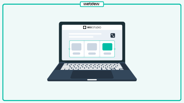
4. Focus on the Rule of thirds
The rule of thirds, a well-known principle in photography, can also be effectively applied to digital marketing and website design.
This principle involves dividing an image or webpage into thirds and placing key elements in the left or right thirds, leaving the remaining space more open. This layout creates a visually appealing composition and helps guide the viewer’s attention. says Richard McKay, CEO & Managing Director of Sprung Gym Flooring.
For example, Apple’s website positions its product images in the right-hand grids, ensuring the accompanying copy and call-to-action (CTA) button receive sufficient focus. Notably, navigation bars are intentionally kept outside these grids to keep visitors focused on the primary CTA, avoiding unnecessary distractions.
While you don’t need to design your entire website around the rule of thirds, it’s an excellent guideline for emphasizing key elements, such as a value proposition or a specific product feature.
5. Follow the Hick’s Law
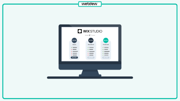
Hick’s Law states that the more choices people have, the longer it takes for them to make a decision. In website design, offering too many options can lead to decision paralysis, overwhelming users, and hindering conversions. shares Raviraj Hegde, SVP of Growth, Donorbox.
Consider the choices users encounter on your website:
Deciding whether to use the navigation bar or scroll further.
Skimming headlines to choose which blog post to read.
Debating between downloading a lead magnet or watching a demo video.
Choosing to create an account, read reviews, or browse more products.
When faced with too many options, users may feel overwhelmed, resulting in higher bounce rates or delays in taking desired actions. To improve conversions, reduce the number of choices on your website. mentions Martin Heaton, Director of Heaton Manufacturing. For example:
Limit the number of call-to-action (CTA) buttons.
Remove clutter around CTAs and use white space to draw attention. This alone can boost conversion rates by up to 232%.
Another effective approach is to use a fullscreen welcome mat on your homepage. It minimizes distractions while directing visitors toward a specific action, helping to balance simplicity with conversion opportunities.
When applying Hick’s Law, focus on the most important actions that align with your conversion goals. Decide whether you want users to opt for your lead magnet, add a product to their cart, or take another specific action. Every page should have a clear, singular objective to guide visitors seamlessly.
6. Use negative space
In web design, whitespace, also known as negative space, refers to the empty areas between visual elements. Positive space, on the other hand, consists of the elements themselves, such as text, images, and CTA buttons.
Whitespace plays a vital role in enhancing readability and user experience. Breaking up large blocks of text into smaller paragraphs increases the negative space, making content easier to scan and digest.
Additionally, incorporating extra margins and padding around larger elements like sidebars, headers, body content, and footers can create more white space. This not only improves the layout’s visual appeal but also helps guide users’ attention to key elements on the page.
7. Use 1080p images
Using high-quality images on your website is essential for creating a strong first impression. Studies show that 60% of buyers are more likely to engage with brands that use images, and 23% are more inclined to contact a business with an image attached to its listing.
However, low-quality images can harm your website’s credibility. Blurry, pixelated, or disproportionate visuals can make your site appear unprofessional. In an interview, M.T.Ray, Managing Director of My Singapore Driver shares, “High-quality photos convey professionalism, build trust, and evoke positive emotions.
That said, avoid using bland or overly generic stock photos, even if they’re high-quality. People connect better with relatable and authentic visuals. Overly corporate or lifeless images can alienate visitors and drive them away from your brand.
8. Consider speed optimization
Customers often have little patience when browsing websites, which is why optimizing page speed is critical. A slow-loading website can frustrate users and lead to higher bounce rates.
To evaluate and improve your website’s speed, consider using these five free tools:
PageSpeed Insights
DebugBear
GTmetrix
KeyCDN
Pingdom
While enhancing page speed, don’t forget to prioritize mobile responsiveness. Ensure your website is user-friendly and fully optimized for mobile devices to provide a seamless experience across all platforms.
Per Markus Åkerlund, CEO of MEONUTRITION, mentions, “While enhancing page speed, don’t forget to prioritize mobile responsiveness. Ensure your website is user-friendly and fully optimized for mobile devices to provide a seamless experience across all platforms.”
9. Use human faces
People connect better with brands that feel human. Including faces and names on your blogs, case studies, landing pages, checkout pages, and pricing pages can help humanize your brand and build trust with your audience.
Gerald Ming, Founder of Whitelabelseo.club, says, “If you aren’t the face of your brand, consider hiring models or using stock photos. However, ensure that the faces you feature authentically represent your brand and resonate with your target audience for maximum relatability
If you aren’t the face of your brand, consider hiring models or using stock photos. However, ensure that the faces you feature authentically represent your brand and resonate with your target audience for maximum relatability.
10. Use the 8-second rule
In today’s fast-paced world, you only have about 8 seconds to capture a visitor’s attention—less than the attention span of a goldfish! This small window of opportunity means you need to make every second count to engage users and drive conversions. adds Poole Brooke Plumlee Attorneys in Virginia.
Here are some effective strategies for grabbing attention and boosting conversions within that 8-second timeframe:
Use bold, concise, benefit-driven headlines.
Follow copywriting best practices to captivate your audience’s imagination.
Incorporate eye-catching images to direct attention to your primary call-to-action (CTA).
Use larger, clearer, and more descriptive signup buttons.
Include power words to make your copy more enticing.
Leverage multimedia content, like videos or GIFs, to explain concepts visually.
Consider using animated exit-intent popups or sound effects to re-engage visitors who are about to leave.
If you’re running multiple marketing campaigns, consider using split testing to determine which one converts best. Dan Close, Founder and CEO at We Buy Houses in Kentucky, explains, “Split testing provides more accurate data than traditional analytics tools like Google Analytics, offering insights that can significantly optimize your conversion rate.
Ready to implement the latest web design trends?
Now that you’re equipped with the 10 website design conversion optimization tips, it’s time to put them into action. Take a close look at your current design and identify areas where you can apply the principles we’ve discussed.
In many cases, small adjustments can make a significant difference. Don’t hesitate to tweak your design where necessary to optimize for conversions. Additionally, consider running A/B tests to pinpoint areas that may need improvement.
I hope you found this blog engaging. Do you have any other questions? Make sure you let me know your thoughts in the comments below.
Frequently Asked Questions
What are current trends in website designs?
Current trends in website design include minimalistic layouts, dark mode options, interactive animations, and bold typography. There’s also a focus on mobile-first design, fast loading speeds, and accessibility. Integrating AI-driven personalization and intuitive navigation are key to improving user experience.
What is an outdated website?
An outdated website lacks modern design elements, is not mobile-friendly, has slow loading times, and uses old technologies. It may feature outdated content, clunky navigation, and unappealing visuals, which can negatively impact user experience and search engine rankings.
Are websites worth it anymore?
Yes, websites remain essential as digital storefronts and hubs for online presence. They establish credibility, offer control over branding, and serve as central platforms for marketing, sales, and customer engagement, even in an era dominated by social media.
Dive Into our Client Testimonials
Listen to business owners like you share how we’ve helped them grow. Your story could be next!
Play Video
“Recently we reached out to Webdew for a website inside of HubSpot and they also did some mocking automation for us.”
Conrad T. WalzVice President, Ortholive
Play Video
“Webdew team was quite honest and quite easy to work with in terms of taking feedback implementing it, showing that it doesn’t happen again and things like making sure that it meets our expectations.”
Uday JoseManaging Director, Enate India
Play Video
“We worked with webdew to help us build our HubSpot website and they did an amazing job with it. They were very quick.”
Nishtha MaheswariCEO, Pinkpowerco
Play Video
“webdew has helped us optimize the sales and marketing processes, and this is automating a lot of processes.”
“Hi everyone my name is Kara and I work as a channel consultant at HubSpot Singapore. I’ve been working closely with webdew agency”
KiaraGeneral Consultant, HubSpot Singapore
Play Video
“Hi my name is Christian from OpenDoors Mortgage team and I’m in the mortgage business and just trying to work on new projects and kind of incorporating HubSpot for my operations”
Christian AmuraoFounder, OpenDoors Mortgage
Play Video
“I’m one of the technology directors for Travelopia. We are the largest experiential travel company in the world. We’ve engaged webdew recently, not recently, it’s been about a couple of quarters now.”
SreekandhTechnology Director, Travelopia
“We worked with Chehak over the past several months to create a series of animated videos for an academic planner that we produce. And from the very beginning, she was absolutely professional and a pleasure to work with.”
Veronica BishopContent Writer, Bishop Content Studio
6x
We helped clients multiply their website conversion rates through strategic design and UX optimization.
20%
Our marketing campaigns led to a 20% uplift in customer engagement across digital channels.
2K+
Delivered over 2,000 qualified leads through targeted funnels and smart automation.
120+
Our video content has earned 120,000+ views, driving brand awareness and audience retention.
“I recently had the pleasure of working with Chehak on a video demo project, and I was thoroughly impressed with her services.”
Matt KayCo-founder, Talem AI
Additional Resources
Access expert tips, trends, and strategies designed for small businesses. Stay ahead of the curve and make informed decisions with our comprehensive resources!


 We typically respond the same day


.svg)


.svg)