We typically respond the same day


Creating a new website comes with many considerations. Besides ensuring that our clients have the most satisfactory experience and can find what they need effortlessly, we also need to consider their maximum engagement with the website. Ultimately, the website’s focus should be turning as many visitors into leads as possible.
But how can you ensure that your website visitors are performing the actions that you want them to? How can you confirm that you are driving them through the marketing funnel?
Well, this is where website CTAs come into play.

Let’s take it from the top! What is a CTA, and how can you make the most of it on your website design? We will answer these and some more questions to help you make the most of this practical marketing strategy.
What is a website CTA?
CTA stands for “call-to-action,” which literally means the “call” to take any “action.” It is an image, a button, or a line of text that encourages your visitors to take an action you desire.
How to use the website CTA to attract more leads?
The first thing you need to consider while creating a CTA is what you want from your visitors. Unfortunately, there is no “one-size-fits-all” solution that you can use to generate leads magically. The actions you need your visitors to perform can vary from submitting a form to downloading a recourse.
Thus, you need to define the actions and be creative in devising various CTA buttons that serve different purposes.
Steps to follow to add relevant CTAs
1. Define the audience
First of all, you need to diversify your website traffic into relevant categories. The audience may consist of direct traffic from the search engines, referrals, leads, potential customers, candidates applying for jobs, and more. What they are looking for is different from one another.
2. Analyze their movement
Once you have categorized your visitors, try to analyze the most common actions they are likely to take. For example, you can’t expect the client to schedule an interview and your candidate to check out your pricing.
In other words, they should not have to browse through several responsive web design templates or landing pages to find what they need.
While adding CTAs, make sure the buttons lead them to relevant pages only.
3. Create actionable CTAs
While a CTA can be as simple as the “click here” button, it does not have to be as dull unnecessarily. As a continuation of my last point, I would like to add that the CTA button should clearly define what the visitor must expect out of performing the action.
In practice, this means that if you want to convert your leads to potential customers faster, you need to include features such as a call widget that will not only prevent customers from leaving but also reply to them right away, boosting customer retention. By doing so, you are creating actionable CTAs that people can easily follow. Now that you have a wider picture of why call widgets and other actionable buttons are important, let’s learn why it’s crucial to pay attention to where they are placed.
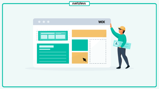
4. Place them well
While placing the CTAs, make sure there is enough content to justify the action. For instance, ask yourself if you would share your email or contact details without verifying the cause and effect. Of course, the audience will consider the same.
Thus, always put the CTA at the bottom of the content. It may be a blog, a case study, a website module, or something else. However, the visitor should always be able to understand the purpose and result of the action.
Now that we are through with the theories, let’s look at the most valuable CTAs you can add to your website.
Seven types of CTAs to use on your website
1. Lead generation
The most essential CTA for any website would be lead generation. Since you are trying to convert visitors into leads, you need to place this category of CTAs in the forefront where they are most visible. For example, if you look at the website of The Recovery Village rehab, you’ll notice they have five CTAs just within the top fold.
Also, you must ensure they are placed on pages and areas with a high percentage of new visitors. The most relevant places for these CTAs are blog posts, pop-ups, and so on.

Make sure these are attractive CTAs which effectively convey the value of clicking on them. When the visitors click on one of these Call-to-action buttons, they should know what exactly to expect from the landing page they are led to.

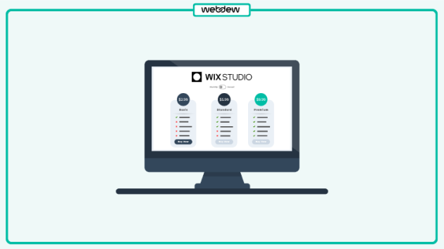
2. Form submission
When they click on a CTA button as mentioned above and are redirected to a landing page, you need them to take two more actions to register them as leads: fill out a form and click on a button to submit their information.

Thus, you need to make sure your landing page has all the information the visitor may be interested in. The forms must be crisp and quick to fill and should not include unnecessary fields that are complicated or time-consuming to fill.

3. The “Read more” button
The read more button is for situations where you don’t want to put all the information out at once. This button best delivers a bulk of text without compromising the UI’s appeal and the UX’s convenience.
The read more button allows your audience to choose whether they want to read or scroll through the entire content.
However, you don’t want them to miss out on the important information. To make the most of the “Read more” button, include a crisp, brief and interesting premise with all the important pointers highlighted.
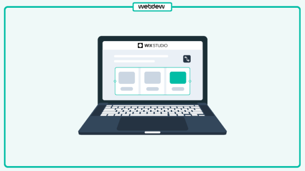
4. Product or service directory
When a potential client visits your website, the first things he/she looks for are the services you offer and the case studies of older projects you have delivered. Thus, you should ensure they can find the same quickly and efficiently.
At the end of the day, your products and services are what keeps your business afloat.
But don’t panic; the CTAs pointing to these do not have to be complex or extra creative. They can be as simple as a line of text. You need to focus on their position and the value of the content that the visitors find once they click on the CTA.
5. Scheduling Interview
Apart from clients, candidates are another robust set of traffic that will be visiting your website. When the candidates come to your website to learn more about your agency or company, they should be able to access all the information they need quickly.
From the candidate’s point of view, the most desired action would be getting interviews scheduled. Therefore, I prefer leaving enough breadcrumbs throughout the website to lead them to the interview scheduling page so that the chances of them scheduling interviews increase.
It is also beneficial to keep an open calendar where the candidates can select a time according to their convenience and availability.
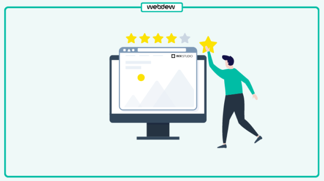
6. Lead nurturing
Once a visitor turns into a lead, the next step is converting them into customers. Often, it so happens that a visitor becomes a lead but is not willing to make the closing. This is where Lead nurturing CTAs come into play.
When it comes to leads, you have to entice them with offers that are more aligned with your product offering than a generic top-of-the-funnel marketing offer.
One of the best examples of this type of ‘call-to-action” is a free demo, free consultation, free quotes, pricing details, etc. For example, firms like Sinclair Law Firm, LLC commonly use “Free Consultation” CTAs to help visitors take the next step confidently, especially when they need guidance on complex issues.
You can also provide the leads with multiple options to ensure they remain engaged and feel they have ample options.
7. Closing the sale
Once you have completed the lead generation and lead nurturing process, the last step is to close the sale. This CTA has to be very sales-focused, and you must encourage the lead to share their contact information or contact the sales team.
Again, we advise not to make this too complicated but focus on its visibility. Ensure to include this CTA wherever you see the opportunity to pitch a product or service.
Thus, the best positions to place them would be the product and blog pages curated to the content.
Bonus!
Lastly, we want to give you a bonus piece that has brought us many leads and helped our sales team meet their targets to a great extent. Given today’s fast-running professional lives, visitors want something quicker than a form; they don’t want to wait for you to revert.
Thus, we took communication to the next level by adding a call button and the phone number on our menu! The visitors can now directly reach out to our executives to clarify their doubts, schedule calls, know about our services, and more.
To make the most of your CTAs, ensure they are actionable, visible, and unique. For any further assistance, do not hesitate to contact webdew.
Editor– Divya Verma.
Dive Into our
Client Testimonials
Listen to business owners like you share how we’ve helped them grow. Your story could be next!


.svg)

“Recently we reached out to Webdew for a website inside of HubSpot and they also did some mocking automation for us.”

“Webdew team was quite honest and quite easy to work with in terms of taking feedback implementing it, showing that it doesn’t happen again and things like making sure that it meets our expectations.”

“We worked with webdew to help us build our HubSpot website and they did an amazing job with it. They were very quick.”

“webdew has helped us optimize the sales and marketing processes, and this is automating a lot of processes.”

“Hi everyone my name is Kara and I work as a channel consultant at HubSpot Singapore. I’ve been working closely with webdew agency”

“Hi my name is Christian from OpenDoors Mortgage team and I’m in the mortgage business and just trying to work on new projects and kind of incorporating HubSpot for my operations”

“I’m one of the technology directors for Travelopia. We are the largest experiential travel company in the world. We’ve engaged webdew recently, not recently, it’s been about a couple of quarters now.”
“We worked with Chehak over the past several months to create a series of animated videos for an academic planner that we produce. And from the very beginning, she was absolutely professional and a pleasure to work with.”


6x
We helped clients multiply their website conversion rates through strategic design and UX optimization.
20%
Our marketing campaigns led to a 20% uplift in customer engagement across digital channels.
2K+
Delivered over 2,000 qualified leads through targeted funnels and smart automation.
120+
Our video content has earned 120,000+ views, driving brand awareness and audience retention.
“I recently had the pleasure of working with Chehak on a video demo project, and I was thoroughly impressed with her services.”
.svg)

Additional Resources
Access expert tips, trends, and strategies designed for small businesses. Stay ahead of the curve and make informed decisions with our comprehensive resources!