


 We typically respond the same day


Practically every client we handle requires a mobile version of their website. It has officially become a necessity. And why not? After all, more than 50% of website traffic comes from smartphones.
With new devices coming up practically every day, it’s hard to keep up with the countless new resolutions. Imagine having to design a website for a dozen different resolutions. Did you like the sound of it? Of course not! It’s possibly the worst nightmare of any mobile developer.
But what about the well-structured websites that look just the same on devices with different screen resolutions? Well, one thing is for sure that no one creates different versions of websites to fit different screen resolutions. So, what is it then?
Well, say hello to responsive web design- the one thing that makes your website look good on practically every device possible!
So, what is a responsive web design?
What is Responsive Web Design?
Smartphones have come a long way. They are now an indispensable part of our lives. No matter what industry or work sector we belong to, smartphones are something we can not do without, not only with respect to connectivity but also ensuring the smooth flow of operations and staying updated.
Almost 2 billion people currently access the internet through their smartphones, which is 51% of the total global base of 3.9 billion mobile users: for those who are marketing their companies on digital platforms, it is mandatory to remember the stats. Here is why,
You must have a website to create an authoritative brand image of your company online. Now, consider having to open a website that is primarily made for desktops or laptops. It is inconvenient and frustrating to swipe on your screen, trying to adjust the web page and read the content.
With audiences judging a website within 50 milliseconds of opening it, we can not risk causing inconvenience in accessing sites on mobile devices. And that’s where a responsive web design saves the day. They are entirely responsible for keeping your audience hooked to your website.
We just learned that our audiences access websites and other online platforms with mobile devices besides laptops and desktops.
The bottom line is to have a single website that can adapt to multiple browsing devices, starting from laptops, tablets, and smartphones. There is a lot of pressure on web designers to design a website that is responsive to the size of the device that it is seen through.
Initially, the idea of creating multiple stylesheets for different screen sizes was in vogue. However, it takes a lot of time, energy, and resources, which is barely affordable for developers and designers.
Yet, thanks to the advancements, a single stylesheet can be developed to service sites on multiple devices, which reduces the designers’ and developers’ labor to deal with so many codes.
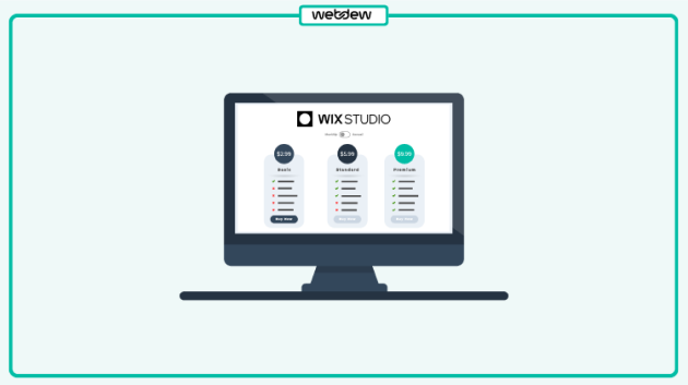
Thus, a responsive web design is an approach where a web designer develops a single web page that automatically resizes itself according to the screen’s size. In this approach, the web page’s design and development respond to the user’s behavior and environment, ensuring a smoother user experience.
What does Responsive Web Design look like compared to traditional layout?
The point of having a responsive website is to have one site that resizes itself on different devices. If we consider a traditionally fixed website, when you open one such website on a smaller device, you are compelled to scroll side-to-side to view certain hidden elements. The images often get distorted in this effort.
It becomes further problematic for tablets because, for most of them, it can either be viewed in landscape or portrait orientation. The navigation becomes even more challenging for smartphone users with their tiny displays. It may increase the load time, and large images may also break the layout.
With a responsive web design, the tablet version can automatically adjust to display only two columns, making the content easy to display and navigate.
For the smartphone, the content may be stacked vertically and can appear in a single column, or the user may be offered the option to swipe over to view other columns.
Instead of getting cut off or spoiling the layout, the media files resize automatically, maintaining an attractive and user-friendly interface.
How does a Responsive Web Design work?
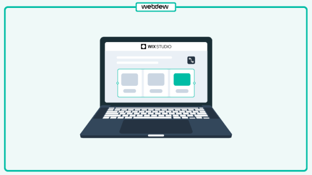
The basis of all responsive websites is the use of fluid grids. Instead of pixels, all page elements are sized by proportion.
For example, consider having three columns: When it comes to a responsive design, you would consider how wide one column should be compared to the other two instead of determining how wide each one should be.
Media files are resized relatively as well. So, an image can stay within its column or relative design element. The webpage first detects the device that it is viewed on and adjusts to the format accordingly. Thus, users experience a more personalized approach.
Advantages
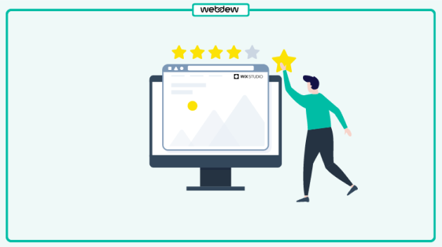
Studies have shown that 57% of internet users refuse to recommend a business with a poorly developed website, and 85% of users seem to believe that a web design on mobile should be equally good or better than that on the desktop.
Responsive website designs make sure you can optimize the user experience by providing them with a design that adapts to their actions and preferences; while eliminating the need for designers to design differently for every new gadget in the market.
The following are responsive web design benefits:

Source: digitalgravity
Disadvantages
These points are not to deflect you from the idea of choosing a responsive design for your website but to give a clear picture of how it still has scope for improvement, like any other concept.
They are not so much like disadvantages as limitations that can be overcome with time and technological advancements. The following are the shortcomings of responsive web design techniques:
Why should you switch to a Responsive Web Design?
The final dilemma is whether or not you should switch to a responsive web design. Now, let’s consider the website traffic and the ratio of people accessing websites through mobile devices. We will realize the need to develop a layout that is suitable for smaller screens.
The ideal situation would be if we had the time and resources to build separate sites optimized for mobile devices. However, that is not the case. So, we have to resort to the nearest plausible solution, which is a responsive design.
This is certainly not the ultimate solution to digital consumers’ continually changing needs, but it can significantly improve user experience. Additionally, it helps the designers and developers cope with the coding by reducing the amount of coding.
Designers can now build custom solutions for more users on a broader range of devices using responsive design. Also, you can build responsive web design in CSS. With every custom design, you offer a better user experience, and with better user experience comes more traffic. Thus, it is a win-win for both your designers and your business.
Facing any issues? Feel free to contact us for web designing services.
Dive Into our
Client Testimonials
Listen to business owners like you share how we’ve helped them grow. Your story could be next!


.svg)

“Recently we reached out to Webdew for a website inside of HubSpot and they also did some mocking automation for us.”
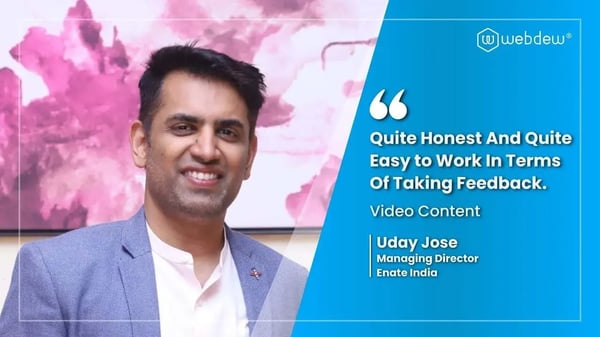
“Webdew team was quite honest and quite easy to work with in terms of taking feedback implementing it, showing that it doesn’t happen again and things like making sure that it meets our expectations.”

“We worked with webdew to help us build our HubSpot website and they did an amazing job with it. They were very quick.”

“webdew has helped us optimize the sales and marketing processes, and this is automating a lot of processes.”

“Hi everyone my name is Kara and I work as a channel consultant at HubSpot Singapore. I’ve been working closely with webdew agency”
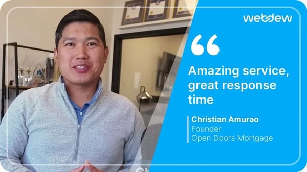
“Hi my name is Christian from OpenDoors Mortgage team and I’m in the mortgage business and just trying to work on new projects and kind of incorporating HubSpot for my operations”

“I’m one of the technology directors for Travelopia. We are the largest experiential travel company in the world. We’ve engaged webdew recently, not recently, it’s been about a couple of quarters now.”
“We worked with Chehak over the past several months to create a series of animated videos for an academic planner that we produce. And from the very beginning, she was absolutely professional and a pleasure to work with.”


6x
We helped clients multiply their website conversion rates through strategic design and UX optimization.
20%
Our marketing campaigns led to a 20% uplift in customer engagement across digital channels.
2K+
Delivered over 2,000 qualified leads through targeted funnels and smart automation.
120+
Our video content has earned 120,000+ views, driving brand awareness and audience retention.
“I recently had the pleasure of working with Chehak on a video demo project, and I was thoroughly impressed with her services.”
.svg)

Additional Resources
Access expert tips, trends, and strategies designed for small businesses. Stay ahead of the curve and make informed decisions with our comprehensive resources!