We typically respond the same day


People find data and information easy to understand when it is visually presented. You might have seen graphs, pictograms, etc., that people use to explain data and information.
Not only is it easy to understand, but it keeps people interested as it is not just plain boring text. And one way to keep people informed and interested is through infographics.
In this blog, let us take a look at what infographics are, why they should be used by everyone and the nine types of infographics. This might come in handy for anyone who wants to present data in an interesting manner, including educators, students, business persons, salespersons, etc.
What is an Infographic?
If we go by the definition, an infographic is a visual representation of any kind of information or data. Be it a study on business stats or a step-by-step tutorial on how to dress-up, an infographic can help you to show that information in the form of an attractive visual graphic.
Take a look at the infographic examples shown below.


There are some points to keep in mind while designing an infographic:
These points easily grab the reader’s attention and give you an overview while you go through the topic. The overall aim of an infographic is not only to inform but also to make the viewing experience fun and engaging. You can get this all by using different elements like icons, colors, shapes, fonts, images, and illustrations.
The infographic above also showcases the statistical visuals of the data using donuts, bars, radials, and charts so that if you can’t understand the text above, you will still get the picture.
You can make the best use of Designcap, graphic design tool to make your infographics like a pro, just Click Here.
Why should you use Infographics?
In this modern world, people have very less time to read a whole topic, and so they skip time consuming content.
Infographics are a very useful tool for them so that they can communicate easily and prove the information about the topic. Everyone will be attracted to colorful visuals instead of only plain text. Visme offers the most unique and creative infographics, which are handy because they quickly grab the attention and don’t let us go.
Not just static images, but even while making motion graphics or animated videos that are educational or gives out information, infographics can be used extensively.
9 Types of Infographics
So how do you choose the best infographic for the best infographic style for your information?
Here I have categorized these infographics into 9 types, based on the type of information included in the infographics.
Statistical Infographics
Statistical infographics are used to show the survey results, present some data or show the data or keep some information in a very easy way. The statistical infographic based on the survey data analysis will keep your focus on the data, while the visuals and layout tell you the story related to your data.
Your storytelling can include elements like icons, charts, images, and eye-catching fonts. Keep in mind that this infographic uses an icon to illustrate every statistic.

Here are some points to keep in mind while designing a statistical infographic:
Informational Infographics
Informational infographics are the best way to visualize a new or specialized concept or to give an overview of a topic. Typically, informational infographics are divided into sections with signifying headers.
Signifying headers and illustrative icons help in communicating better. Numbering in every section will play the best part in making the infographic design flow. People usually prefer the numbered infographic in comparison to any other.

Use techniques like switching up the colors and directions to keep your infographic engaging. You have to keep some points in mind while designing an infographic:
Timeline Infographics
A Timeline infographics template is the best way to visualize the history of something, highlighting important dates or an overview of events. The timeline of a project is one of the best examples of a timeline infographic.
Normally, humans tend to make sense of time spatially. Visual-like timeline infographics help in creating a clear picture of the timeframe. Using elements like icons, labels, text, photos, you can highlight and explain the points in time.

Here are some points you should keep in mind while designing a timeline infographic:
Process Infographics
A timeline infographic is used to highlight the points in time, while process infographics are used to provide a summary or overview of the steps used in a process.
Process infographic allows you to simplify and clarify each step in the process. Generally, process infographics use left-to-right or top-to-bottom flow, thereby making your process easy to follow if you label each step by numbers.

You can also use arrows and lines as directional cues to show the flow of your infographic. In case many steps are included in the infographic, you can use the ‘snake’ layout in your infographic. Your point will go back and forth in the infographic in ‘S-Shape.’
You have to keep two points in mind while designing an infographic:
Geographic Infographics
A Geographic infographics template is used when you want to show the location-based data, democratic view, or a showing the data in large quantities. In geographical infographics, you can use map charts as the focus visuals. Different map charts are used for showing different types of data.

Here are some points you should keep in mind while designing a geographic infographic:
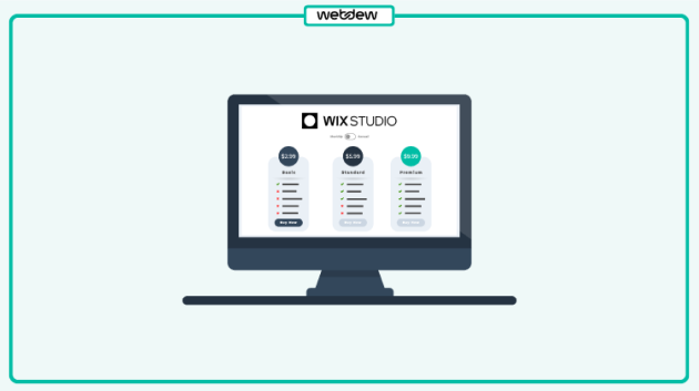
Comparison Infographics
Sometimes, it can be challenging to choose between two or more options. Comparison infographics are the best way to compare the options based on the features of a product or service. Comparison infographics split the features vertically or horizontally with the key points in the middle.
While you want to compare more than two options, dividing your infographic into two half won’t be satisfying. Instead, you can divide your infographic into multiple sections. It can be horizontally or vertically.

You can use techniques like switching up the colors and directions to keep your infographic engaging.
Here are some points to keep in mind while designing comparison infographics:
Hierarchical Infographics
A hierarchical infographic is used to organize the items least to great or vice versa. The most known example of this type of infographic is the pyramid infographic.

One more example of the hierarchical infographic is visualizing a chain command or showing something is broken into parts. A flowchart is also part of this infographic.
List Infographics
If you want to list some options, or collection of items, or a list of examples, you can make use of a list infographic. List Infographics are mostly straightforward— the main goal is to make them more attractive and engaging than a simple list.
Icons can be replaced with bullet points, and the colors used can make your list stand out. You can also number the points in your list to create a flow in your list.

It is not a hard final rule that a list always follows the top-to-bottom or left-to-right rule. You can also try unconventional layouts like S-shaped or circular layouts in list infographics.
Resume Infographics
The modern corporate world has grown from old school to a professional standard. And this is why resume templates have become popular through the years.
However, nothing much will be changed from a traditional to a modern resume. The difference is that it will have attractive visuals to stand out in an interview, publish on your website, or attach into an email.

Here are some points to keep in mind while designing a resume infographic:
The Bottom Line
Infographics are viral these days. The use of infographics makes your content easier to understand, as most visuals are seen in the form of icons and images.
Human eyes get attracted to colors, and therefore the use of different colors on infographics is a benefit to draw readers’ attention.
In this blog, you have seen the different types of infographics to represent or arrange your data. So next time, you can use some of these popular infographic styles to easily convey your information.
You can even animate these infographics to make interesting videos like motion graphics animation. It can come in handy especially for explainer videos. Did you know that you can create responsive infographics in After Effects?
Here at webdew, we have a great team of experienced graphic designers to design your infographic. Contact us for more details.
Editor: Amrutha
Dive Into our
Client Testimonials
Listen to business owners like you share how we’ve helped them grow. Your story could be next!


.svg)

“Recently we reached out to Webdew for a website inside of HubSpot and they also did some mocking automation for us.”

“Webdew team was quite honest and quite easy to work with in terms of taking feedback implementing it, showing that it doesn’t happen again and things like making sure that it meets our expectations.”

“We worked with webdew to help us build our HubSpot website and they did an amazing job with it. They were very quick.”

“webdew has helped us optimize the sales and marketing processes, and this is automating a lot of processes.”

“Hi everyone my name is Kara and I work as a channel consultant at HubSpot Singapore. I’ve been working closely with webdew agency”

“Hi my name is Christian from OpenDoors Mortgage team and I’m in the mortgage business and just trying to work on new projects and kind of incorporating HubSpot for my operations”

“I’m one of the technology directors for Travelopia. We are the largest experiential travel company in the world. We’ve engaged webdew recently, not recently, it’s been about a couple of quarters now.”
“We worked with Chehak over the past several months to create a series of animated videos for an academic planner that we produce. And from the very beginning, she was absolutely professional and a pleasure to work with.”


6x
We helped clients multiply their website conversion rates through strategic design and UX optimization.
20%
Our marketing campaigns led to a 20% uplift in customer engagement across digital channels.
2K+
Delivered over 2,000 qualified leads through targeted funnels and smart automation.
120+
Our video content has earned 120,000+ views, driving brand awareness and audience retention.
“I recently had the pleasure of working with Chehak on a video demo project, and I was thoroughly impressed with her services.”
.svg)

Additional Resources
Access expert tips, trends, and strategies designed for small businesses. Stay ahead of the curve and make informed decisions with our comprehensive resources!