We typically respond the same day


If you’re in the ecommerce industry, you know the importance of having an online store. It will work as your business’s storefront. Without an online store, your audiences will never find you. Moreover, you cannot capture your audience’s attention.
In such cases, you can use Shopify to create an online store. But knowing a website builder and using it are two different things. If you want some inspiration, you can take a look at different Shopify store examples.
In this article, I will discuss some great examples of a Shopify store. This way, you will be able to know some top Shopify store designs. Let’s get started.
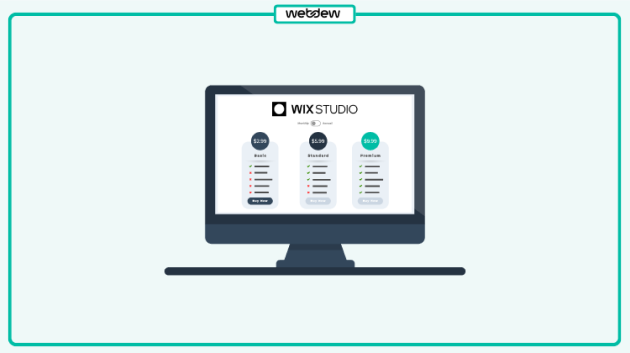
Best Shopify Store Examples
Now, it’s time to focus on the main part. You need to know the best Shopify store examples so that you can create your perfect one. You don’t need to copy. Just getting some inspiration or head start will go a long way. Exploring the best Shopify store examples can give you clarity on what works. You can also begin your own WhatsApp eCommerce Store with WhatsApp platform.
1. Gymshark
Gymshark, one of the most prominent names in the fitness industry, is an excellent example of a successful brand built on Shopify.

Catering to both men and women, this online shopping platform value lies in offering functional sportswear that combines practicality with a stylish, eye-catching design. Gymshark proves that you can look your best in the weight room while rocking some of the trendiest athletic apparel.
What truly sets Gymshark apart visually is the sophistication of its detailed product cards. The site features high-quality images and videos showcasing models wearing their outfits and accessories. For those seeking inspiration from Shopify stores with exceptional use of visuals, Gymshark is a standout choice.
2. Aque Apparel
Here’s another excellent example of a Shopify site that leverages the platform’s design flexibility to create an attractive and audience-focused online presence.

This brand achieves alignment with its target audience through several key strategies:
This Shopify website demonstrates how thoughtful design choices can effectively capture the attention of younger shoppers and strengthen brand appeal.
3. Cookie Chips
Cookie Chips is a standout Shopify store that specializes in a single irresistible product: cookies. Using GemPages, the store delivers a seamless and visually engaging user experience, with a strong focus on highlighting its delectable offering.

From the moment visitors land on the site, they’re welcomed by a clean and well-organized layout. The homepage prominently displays an assortment of cookie options, allowing shoppers to start their purchasing journey with ease—an effective tactic for driving sales in single-product stores.
One innovative feature of the site is its dual-view design, which lets customers simultaneously admire the attractive packaging and review key details about ingredients and calorie content. This thoughtful approach not only elevates the shopping experience but also provides a quick and comprehensive way for customers to learn about the product.
4. WaveBeamPro
WaveBeamPro is a premium headlamp brand tailored for outdoor enthusiasts, including hikers, campers, runners, and adventurers. Its website features a sleek, modern design with contrasting light and dark tones, making it easy for visitors to quickly grasp the product’s key features.

A prominent discount banner at the top of the homepage, paired with a clear call to action, immediately captures attention and encourages conversions.
The homepage also highlights customer testimonials and reviews, reflecting the brand’s confidence in its product while adding value for potential buyers. By showcasing positive feedback from satisfied users, WaveBeamPro effectively builds trust and motivates visitors to make a purchase.
5. State of Kind
State of Kind, a single-product skincare brand, perfectly embodies its “do more with less” philosophy through a clean, minimalist website design. The site strikes a balance between text and visuals, ensuring the content remains clear and engaging without overwhelming visitors.

A standout feature of this store is its dedicated “Our Philosophy” page, which shares the story behind the product. This thoughtful addition not only helps potential buyers connect with the brand but also enhances its positive image by fostering a deeper understanding of its values and mission.
6. Bokksu
Bokksu, a Japanese subscription-based single-product store, excels at conveying a strong brand identity through its website.

The signature orange color is used consistently across the site—in the header, hero banner, product images, text, and CTA buttons—creating a cohesive visual experience that reinforces brand recognition and helps customers associate the color orange with Bokksu.
Additionally, the homepage features a short video explaining that Bokksu offers more than just products—it provides an experience. Subscribers can learn about, taste, and immerse themselves in Japanese culture, all from the comfort of their own home.
7. Batch Organics
Batch Organics, winner of the Best Design for Customers category in the 2017 Shopify Commerce Awards, is a prime example of an engaging Shopify store. Specializing in flash-frozen smoothies and breakfast bowls, the store grabs customer attention with bright, vibrant images.

In terms of customer experience, Batch Organics excels by offering a simplified purchase process. All you need to do is click on the CTA “create a box” and you’ll be taken to a page where you can easily choose from various menu combinations, each accompanied by mouth-watering images.
The streamlined and user-friendly purchase process boosts conversion rates, proving that simplicity is key to a successful eCommerce experience.
8. BlendJet
The first thing that grabs visitors’ attention on BlendJet’s website is the hero section, featuring a full-screen video. This dynamic visual showcases the BlendJet 2 in a variety of vibrant colors and patterns, emphasizing the joy and simplicity of drink preparation. The bright, refreshing imagery evokes a sense of freshness and makes owning a portable blender feel both desirable and practical.

The homepage is thoughtfully designed with a grid layout that organizes key sections, including product displays, user testimonials, and a frequently asked questions area.
The consistent use of pastel colors aligns with the brand’s identity, blending cool and warm tones to create a visually appealing and engaging interface that highlights the product effectively.
9. Snooz
Exploring Snooz’s website is a delightful experience. With its clean, intuitive design and persuasive messaging, the site perfectly aligns with the brand’s focus on promoting peace and relaxation—like a visual lullaby. The clever use of white space enhances the calming aesthetic, reinforcing the brand’s soothing identity.

What truly sets Snooz apart is its standout copy. A series of clever, impactful taglines instantly captures attention and leaves a lasting impression. Through this approach, Snooz effectively communicates its heartfelt promise of delivering restful sleep, making its message both memorable and compelling.
10. Smoovii
Smoovii’s website, dedicated to selling smoothie blenders, immediately grabs attention with its captivating background photo. The clean design and smooth navigation ensure a browsing experience that feels effortless and enjoyable.

The site features high-quality images of their blenders, while the carefully chosen font complements the brand’s aesthetic.
Smoovii goes beyond just selling products—they also provide healthy smoothie recipes and guide customers on how to get the most out of their exceptional blenders.
11. GiveMeTap
GiveMeTap goes beyond just selling bottles by telling a powerful, impactful story. The homepage features a prominent hero banner with clear Calls to Action (CTAs), centered around this meaningful narrative.

The standout “Learn More” button directs visitors to the brand’s mission of environmental protection and providing clean water to communities in Africa. Positioned next to the “Shop Now” button, it reinforces the message that purchasing a bottle contributes to a positive social impact.
With a strong commitment to providing clean water in Africa, every element of the website is designed to support this cause, with many CTAs following the “Shop-Give” pattern.
The store also boosts its credibility by showcasing press mentions, strengthening its trustworthiness. Customers can feel confident that their purchase not only supports their needs but also makes a real difference in the lives of those in need on the African continent.
12. Dripsie
Dripsie specializes in kitchen sink strainers, and its homepage makes this clear right from the start. A straightforward yet impactful image captures the essence of the business, with a contrasting color for the CTA button that draws attention. A key feature to note is the streamlined navigation bar, which guides visitors directly to the information they need.

As you scroll down, the business’s story is easily accessible with just a click, available in podcast format. This storytelling approach effectively showcases the brand’s inspiring journey, vision, and values, offering an engaging way for customers to connect with the business.
13. Attipas
Attipas has become well-known for selling children’s shoes with rubber soles, designed to replicate the sensation of walking barefoot. Endorsed by Australian podiatrists, these shoes function as both shoes and socks, available in a wide range of sizes, colors, and patterns.

The brand’s marketing emphasizes the benefits of these shoes for young children and those just learning to walk.
Attipas has successfully promoted itself through various social media channels and has been featured in publications and on television. The website also attracts new customers by offering promotional codes and monetary incentives to those who subscribe to their mailing lists.
14. Neck Hammock
Neck Hammock promotes a simple solution for relieving neck and head pain, positioning its device as an easy addition to any routine. The brand’s marketing strategy extends beyond influencer promotions, focusing heavily on authentic customer testimonials. The official website features numerous positive product reviews from real users, adding credibility and trust.

Their Shopify store, designed around a single product, operates smoothly and processes orders efficiently. Thanks to the product’s one-size-fits-all design, Neck Hammock also offers bundle deals, encouraging customers to purchase more than they initially planned. It’s a great option for anyone looking to give a device to someone who struggles with neck pain.
15. Bluboho
Bluboho is a perfect example of a Shopify website with a sleek, high-end aesthetic. From the moment you land on their homepage, it’s immediately clear that they specialize in carefully handcrafted jewelry made from recycled metals.

If you haven’t yet followed Bluboho’s lead, it’s time to do so. Infuse your website with your unique value proposition, ensuring that visitors instantly understand what you offer and what sets you apart.
Another standout feature of this site is its clean, curated design. Navigating through the various sections is a pleasant experience, with each part of the website reflecting the brand’s elegant, minimalist approach.
16. MakerGear 3D Printers
MakerGear 3D Printers initially started by selling 3D-printed pieces but has since expanded to offer its own line of printers and accessories.

What makes their Shopify store stand out is how their experience has shaped a design that is both simple and conversion-focused. This expertise is evident as soon as you enter the site.
The homepage features a slider above the fold that highlights key printer features such as high-performance, low-maintenance, readiness, and excellent customer support. As you scroll down, the entire homepage functions like a landing page, providing insight into the company, details about their printers, and guiding visitors toward product cards for easy shopping.
17. Sasha + Lucca
This children’s wear store won the Best Homepage category at the 2017 Shopify Awards, showcasing how a clean, simple, and “fresh” design can effectively appeal to a younger audience.

The creators of the store have also excelled in building a strong brand identity. From the pastel colors that dominate the site (mirroring the hues of their products) to the choice of font, every element is carefully selected. Together, these aspects convey the brand’s core values: simplicity and sophistication with a playful, childlike charm.
This Shopify website serves as a great example of brand-focused design, offering inspiration for any brand looking to refine its identity.
18. Hawkers
Hawkers is another excellent example of how to create a popular Shopify store with a simple design.

The banner that greets visitors on their homepage not only perfectly aligns with their graphic identity but also serves as a platform to promote their collaboration with Paula Echevarría. From the start, their strategy has centered around partnerships with influencers and micro-influencers.
What makes this Spanish Shopify store especially notable is that, despite its growth, Hawkers has stuck with Shopify since its inception. This longevity proves that Shopify is a versatile CMS, capable of supporting eCommerce businesses of all sizes.
For those curious about how influencer-driven brands can look on Shopify, Hawkers is a prime example.
19. Doly
Doly is a trendy Shopify store that specializes in eco-friendly shoes made from recycled plastic in Spain.

One interesting feature of their website is the use of social proof: every time a customer makes a purchase, a small pop-up notification appears, showing the product that has just been bought. This tactic subtly encourages curiosity—while you may not have considered the product before, seeing others buy it piques your interest and may lead you to purchase the same item.
If you’re interested in learning more about social-proof tactics, this Shopify store is definitely worth exploring.
Ready to build a successful Shopify store?
After observing these stores, think about how you can incorporate similar features into your own Shopify website. Whether it’s through clean design, social proof, streamlined navigation, or optimized purchase processes, there’s a lot you can adapt for your eCommerce store.
With Shopify’s flexibility, the possibilities are endless. Use these examples as a source of inspiration to build a store that not only looks great but also provides an exceptional shopping experience for your customers. Happy building!
Dive Into our
Client Testimonials
Listen to business owners like you share how we’ve helped them grow. Your story could be next!


.svg)

“Recently we reached out to Webdew for a website inside of HubSpot and they also did some mocking automation for us.”

“Webdew team was quite honest and quite easy to work with in terms of taking feedback implementing it, showing that it doesn’t happen again and things like making sure that it meets our expectations.”

“We worked with webdew to help us build our HubSpot website and they did an amazing job with it. They were very quick.”

“webdew has helped us optimize the sales and marketing processes, and this is automating a lot of processes.”

“Hi everyone my name is Kara and I work as a channel consultant at HubSpot Singapore. I’ve been working closely with webdew agency”

“Hi my name is Christian from OpenDoors Mortgage team and I’m in the mortgage business and just trying to work on new projects and kind of incorporating HubSpot for my operations”

“I’m one of the technology directors for Travelopia. We are the largest experiential travel company in the world. We’ve engaged webdew recently, not recently, it’s been about a couple of quarters now.”
“We worked with Chehak over the past several months to create a series of animated videos for an academic planner that we produce. And from the very beginning, she was absolutely professional and a pleasure to work with.”


6x
We helped clients multiply their website conversion rates through strategic design and UX optimization.
20%
Our marketing campaigns led to a 20% uplift in customer engagement across digital channels.
2K+
Delivered over 2,000 qualified leads through targeted funnels and smart automation.
120+
Our video content has earned 120,000+ views, driving brand awareness and audience retention.
“I recently had the pleasure of working with Chehak on a video demo project, and I was thoroughly impressed with her services.”
.svg)

Additional Resources
Access expert tips, trends, and strategies designed for small businesses. Stay ahead of the curve and make informed decisions with our comprehensive resources!