


 We typically respond the same day

A HubSpot CMS website can be genuinely powerful. But most teams build one, launch it, and then wonder why traffic isn't converting. Nine times out of ten, the problem isn't the platform, it's the design decisions made on top of it.
This post covers the most common HubSpot website design mistakes, why each one hurts, and what to do differently. Every section is self-contained, so jump to whatever's causing you problems right now.
1. Copying the Stock Template Without Customizing It
The problem: HubSpot's marketplace has hundreds of templates. Many teams pick one, swap in their logo and brand colors, and call it a website. The result looks clean enough but it looks exactly like three other companies in the same space.
Generic templates carry generic structure: the same hero section width, the same card grid, the same footer layout. None of it reflects how your customers actually think about your service. When a prospect lands on your page and nothing speaks directly to their situation, they leave.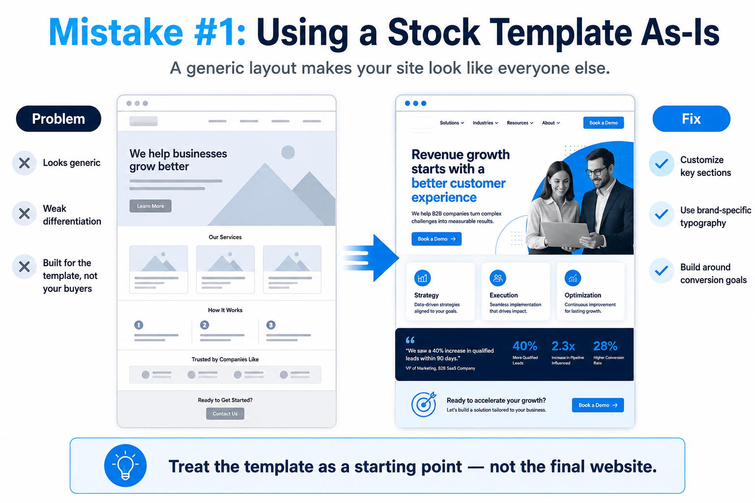
The fix: Treat the template as a starting point, not a finished product. Rebuild key sections especially the homepage hero, service pages, and primary landing pages using custom HubSpot development that reflects your actual value proposition. That means custom modules, brand-specific typography, and layouts built around your conversion goals, not the template designer's defaults.
Before touching any template, invest time in a proper design mockup. Teams that skip wireframing often rebuild the same mistakes twice.
2. Designing for Desktop and Ignoring Mobile
The problem: HubSpot CMS supports responsive design but responsive doesn't mean automatic. A two-column layout that looks sharp on a 1440px screen can collapse into an unreadable mess on a phone. Buttons too small to tap. Text that overflows its container. Images that load at full resolution on a 4G connection.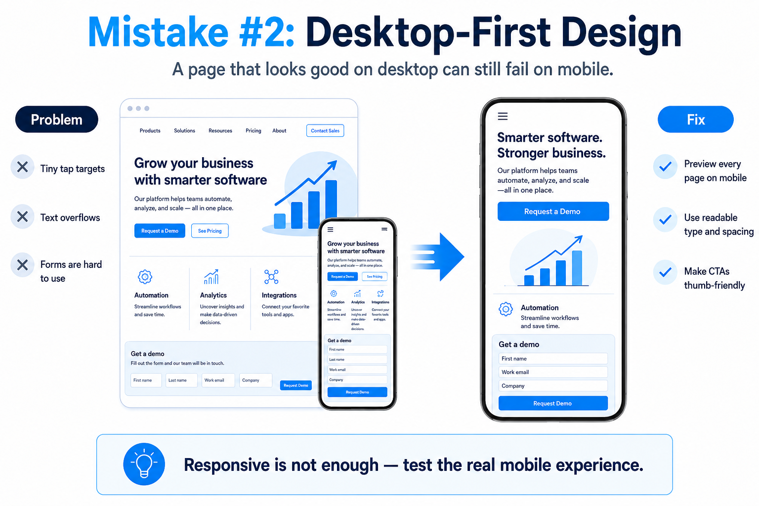
More than 60% of B2B buyers research vendors on mobile before they ever sit down at a desktop. A broken mobile experience isn't just a design problem; it's a lost lead.
The fix: Use HubSpot's built-in device preview during every design pass. Test on actual phones, not just the browser's responsive emulator. Set font sizes with relative units. Make CTAs at least 44px tall. Check that forms are usable with a thumb, not just a mouse.
3. Leaving HubSpot Smart Content Unused
The problem: HubSpot lets you show different content to different visitors based on lifecycle stage, list membership, country, device type, and referral source. Most websites ignore this entirely and show the same page to a first-time visitor from a cold ad and a returning contact who's already in a deal.
That's a missed opportunity. A returning prospect who visited your pricing page twice doesn't need the same hero copy as someone who found you through a blog post.
The fix: Start small. Use smart CTAs to show different offers based on the lifecycle stage. Show a returning visitor a case study CTA instead of a top-of-funnel lead magnet. Personalize the homepage hero headline for contacts already in your CRM. HubSpot's smart content rules are visual and straightforward; this is one of the few things you can do without touching any code.
4. Weak or Misplaced Calls to Action
The problem: The most common HubSpot CMS error isn't technical, it's strategic. Pages get built with one CTA at the bottom, phrased generically ("Contact Us" or "Get Started"), placed where most visitors never scroll.
A page with no clear next step doesn't convert. And a CTA that asks for too much commitment too early like "Book a Demo" on a blog post where the reader just arrived pushes people away.
The fix: Match the CTA to where the visitor is in their decision process. Top-of-funnel content gets a low-friction offer: a guide, a checklist, a short video. Mid-funnel pages get a case study or a comparison. Bottom-funnel pages get the demo request or the consultation.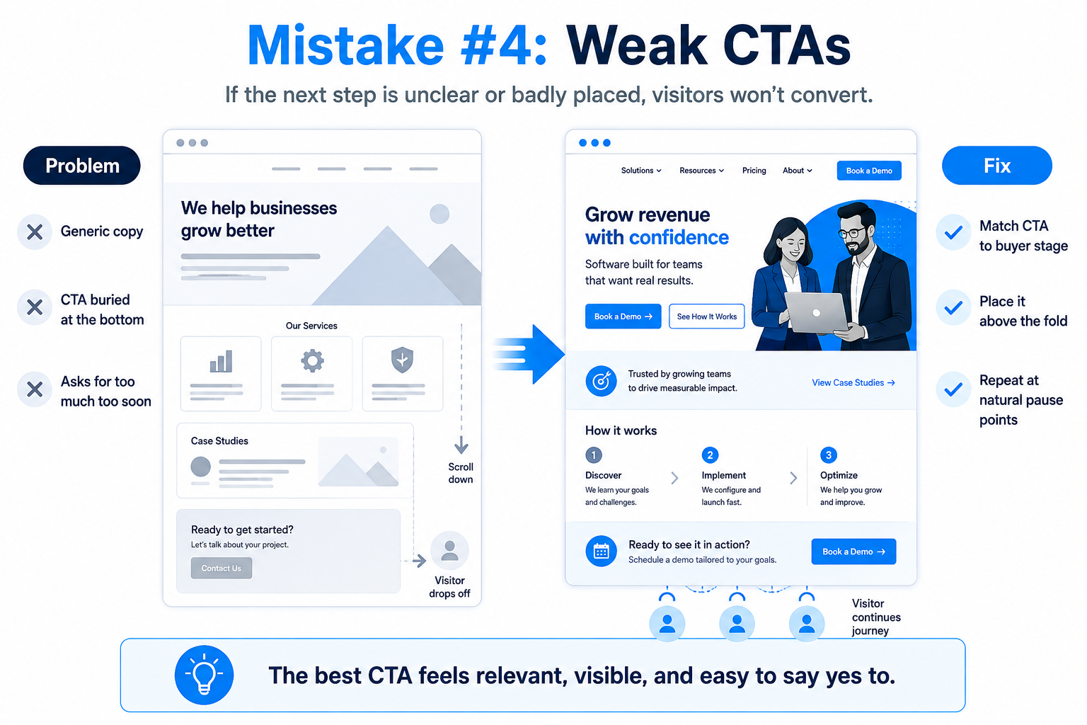
Place the primary CTA above the fold and repeat it at natural pause points not just at the bottom. Run A/B tests inside HubSpot to see which phrasing and placement actually converts. Understanding what to look for when choosing a web designer also applies here: whoever builds your HubSpot pages should understand conversion design, not just aesthetics.5. Disconnecting Design from HubSpot Workflows and CRM
The problem: HubSpot's strength isn't just as a website builder it's as a connected platform where design, data, and automation work together. When your website is treated as a standalone design project, you end up with forms that don't feed the right lists, CTAs that create contacts with no lifecycle stage, and lead data that never triggers a follow-up.
This matters most on landing pages and gated content pages. If a visitor fills out a form and nothing automated happens, you've wasted the conversion.
The fix: Before finalizing any page design, map out what should happen after someone interacts with it. Which workflow triggers? Which list do they join? Which sales rep gets notified? Build the form fields to capture the data your workflows actually need.
This is exactly what webdew did for Stax Capital, a real estate investment firm that was manually vetting marketplace registrations, a process that took days. By rebuilding their HubSpot website with automation baked into the design from the start, webdew created a fully automated user approval flow using HubSpot Memberships, Workflows, and Lists. No custom code required. The result: faster onboarding, higher-quality leads, and an 85.31% average engagement rate. Total site traffic grew from 2,709 visits in November 2024 to 20,965 in May 2025.
6. Slow Pages from Unoptimized Assets
The problem: A beautifully designed HubSpot page that takes four seconds to load is a bad page. Large image files, uncompressed JavaScript, and third-party scripts that fire on every page load add up quickly.
Google's Core Web Vitals factor directly into search rankings. A site that loads slowly loses organic visibility and frustrates visitors before they ever read a headline.
The fix: Compress every image before uploading. Use HubSpot's native image optimization settings and set lazy loading on images below the fold. Audit your page for unnecessary third-party scripts every tracking pixel, chat widget, and analytics tag has a cost. Run pages through Google PageSpeed Insights and treat anything below 70 on mobile as a blocker.
7. Poor Navigation and Information Architecture
The problem: Navigation gets treated as an afterthought in most HubSpot builds. Teams replicate whatever nav structure existed on the old website without asking whether visitors can actually find what they need.
A confusing menu is a direct cause of high bounce rates. If a prospect can't figure out where to find your pricing or your service details in under five seconds, they stop looking.
The fix: Limit your primary navigation to five to seven items. Group service pages under clear parent categories. Use HubSpot's menu modules to build nav structures that work on both desktop and mobile. Test with real users and ask them to find your most important page without any guidance and watch where they get stuck.
The broader principles behind good web design apply here too. For a solid foundation before any HubSpot build, this overview of web design fundamentals covers what actually drives engagement and usability.
8. Migrating to HubSpot CMS Without Rethinking the Design
The problem: Migrations from WordPress, Squarespace, or a legacy CMS are a common trigger for HubSpot CMS errors that stick around for years. Teams move content over, rebuild pages to look roughly similar to the old site, and assume the migration is done.
But if the old site wasn't converted, copying its structure into HubSpot doesn't fix the problem. You've just moved a broken experience to a new platform.
The fix: Treat any migration as a redesign opportunity. Audit which pages on the old site drove actual leads or revenue, and prioritize those for a full rebuild. For the rest, clean up the structure, rewrite weak CTAs, and take advantage of HubSpot-specific features: smart content, built-in analytics, CRM-connected forms that didn't exist in the previous setup.
The benefits of custom website development become clearest during a migration: a site rebuilt to your actual business goals performs differently than one simply copied from the old design.
This was a core part of the Stax Capital project. Webdew moved the client from a heavily customized WordPress site that was "diluting the business messaging" to a HubSpot CMS build with redesigned information architecture, automated workflows, and content gating for registered investors. Traffic grew nearly 8x in six months.
The Pattern Behind All of These Mistakes
Most HubSpot design problems come from treating the website as a design deliverable rather than a business system. The platform can handle personalization, automation, lead tracking, and content delivery but only if the design decisions are made with those capabilities in mind from the start.
If your HubSpot site looks fine but isn't performing, the answer usually isn't a visual refresh. It's rethinking the conversion logic, the content structure, and how the site connects to your sales process.
Start with one page that matters. Fix the CTA, test the mobile experience, connect the form to the right workflow. That one page will teach you more about what your site actually needs than any design audit.
Webdew builds and optimizes HubSpot websites for B2B companies. View our HubSpot development services or read more about the Stax Capital project.
Dive Into our
Client Testimonials
Listen to business owners like you share how we’ve helped them grow. Your story could be next!





.svg)

“Recently we reached out to Webdew for a website inside of HubSpot and they also did some mocking automation for us.”

“Webdew team was quite honest and quite easy to work with in terms of taking feedback implementing it, showing that it doesn’t happen again and things like making sure that it meets our expectations.”

“We worked with webdew to help us build our HubSpot website and they did an amazing job with it. They were very quick.”

“webdew has helped us optimize the sales and marketing processes, and this is automating a lot of processes.”

“Hi everyone my name is Kara and I work as a channel consultant at HubSpot Singapore. I’ve been working closely with webdew agency”

“Hi my name is Christian from OpenDoors Mortgage team and I’m in the mortgage business and just trying to work on new projects and kind of incorporating HubSpot for my operations”

“I’m one of the technology directors for Travelopia. We are the largest experiential travel company in the world. We’ve engaged webdew recently, not recently, it’s been about a couple of quarters now.”
“We worked with Chehak over the past several months to create a series of animated videos for an academic planner that we produce. And from the very beginning, she was absolutely professional and a pleasure to work with.”


6x
We helped clients multiply their website conversion rates through strategic design and UX optimization.
20%
Our marketing campaigns led to a 20% uplift in customer engagement across digital channels.
2K+
Delivered over 2,000 qualified leads through targeted funnels and smart automation.
120+
Our video content has earned 120,000+ views, driving brand awareness and audience retention.
“I recently had the pleasure of working with Chehak on a video demo project, and I was thoroughly impressed with her services.”
.svg)
